NaN Jaune


Closed Contact
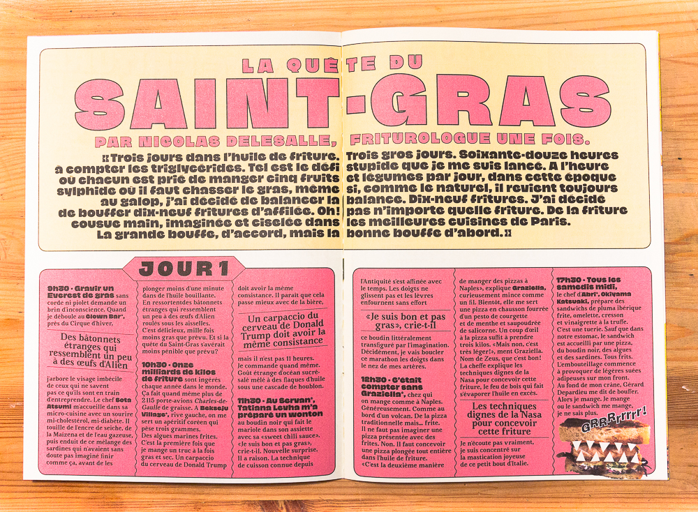
We’re told that apertures shouldn’t look too closed in a bold type and that optical sizes are intended for use at specific sizes *only*. Jaune says no to these type design conventions! It follows this NaN motto: take a bad idea and do it well, or at least die trying.
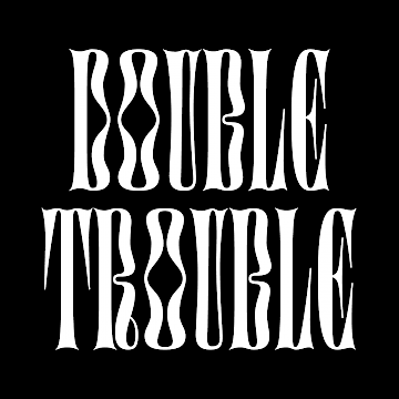
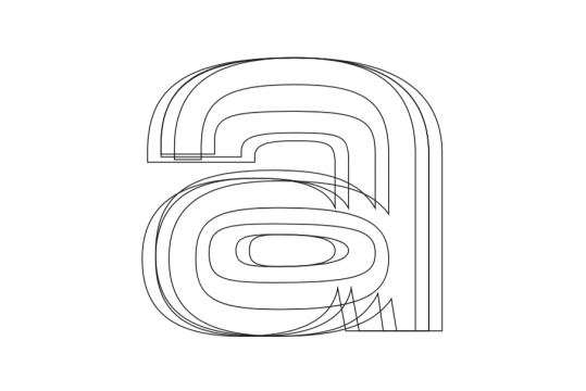
If one typically avoids colliding glyph anatomy then Jaune looks at the problem upside down and sticks together that which normally shouldn’t touch. In a world where physical contact should be avoided, Jaune embraces social non-distancing.
Not able to touch each other, Jaune letters start to touch themselves.
A Truly Grotesk Grotesque
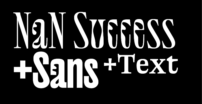
Having its roots in early grotesque types but also taking inspiration from Roger Excoffon’s Antique Olive’s compact proportions, Jaune draws its own path and tries to renew the genre with its unique approach to structures, proportions, aperture treatment and contrast. Contrast is one of the key features of the family with the difference between thin and thick strokes being dramatic for a grotesque. This contrast, taking place in surprising places and accompanied by thin junctions, brings an elegance which sans-serif typefaces sometimes lack. A decision was made to maintain a healthy amount of contrast in the lighter weights, rooting them in an almost calligraphic heritage.
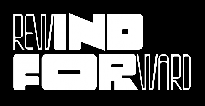
Following the lead of its parent Antique Olive Compact, Jaune Maxi was created with compactness in mind. With its tight spacing and short extenders Maxi allows compact and powerful text blocks with minimal leading and letter-spacing, making it ideal for strong headlines.
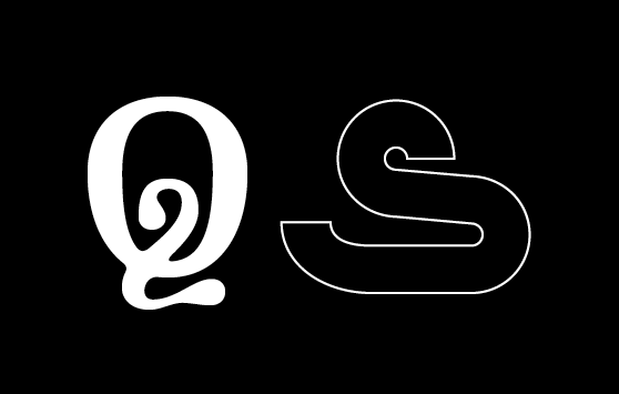
Jaune’s design process shows that, once again, constraints push for innovations. The challenge of having closed shapes and packing the maximum of weight in to the Maxi Black style lead to some of the most distinctive shapes in the family as seen in the /a, /e and /g. Distinctive shapes that have then been rolled out in all styles.
A Family of Contrasts
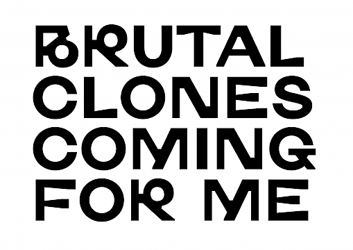
In one final act of contradiction Jaune introduces its Mini sub-family as an effort to re-map the characteristics of a super display typeface to one suitable for longer texts. Jaune Mini conveys the ideas present in its two big sisters but plays with exaggerated details: very open counters, large ink-traps and simplified structures. All artifacts improve its legibility and make it a perfect choice for longer text and smaller size use.
But these exaggerated details also play well when seen at large size. So once again, follow the NaN motto: do whatever you want with the fonts, rules are here to be broken. And note that all glyphs are available in all styles in their respective touching / non touching alternates. Then you can have a non-touching Jaune Maxi and touching Jaune Mini.
At the end of the day, Jaune is a family of contrasts. Ranging from the blackest Black to a razor sharp Thin, and from ultra display to ultra text, with a langage coverage of 224 latin languages, it’s intended to play in a tremendous variety of contexts.
Spacing and kerning by Igino Marini
Name taken from Jaune
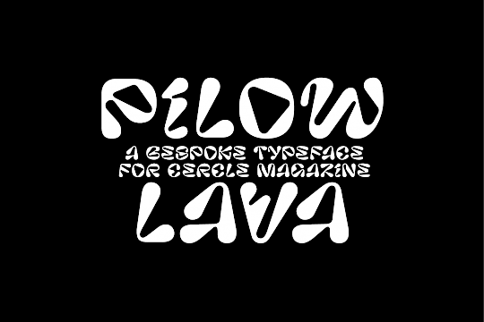
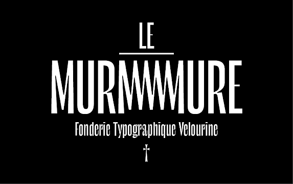
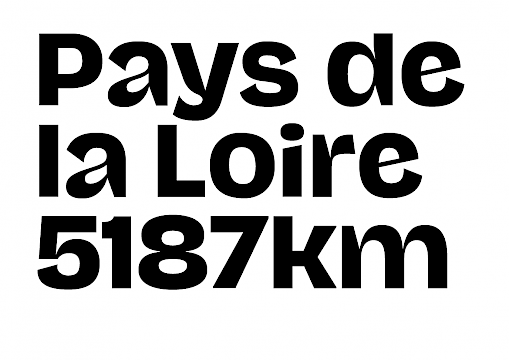
NaN Jaune in use
Supplément guide Fooding
AAAAA Atelier