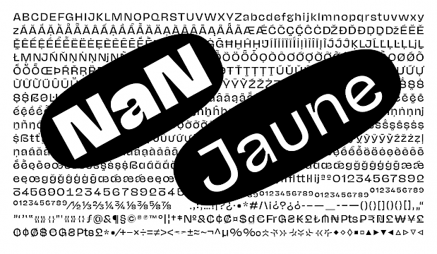
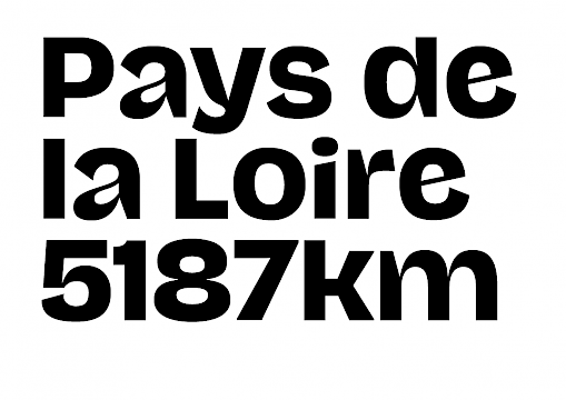
NaN Success


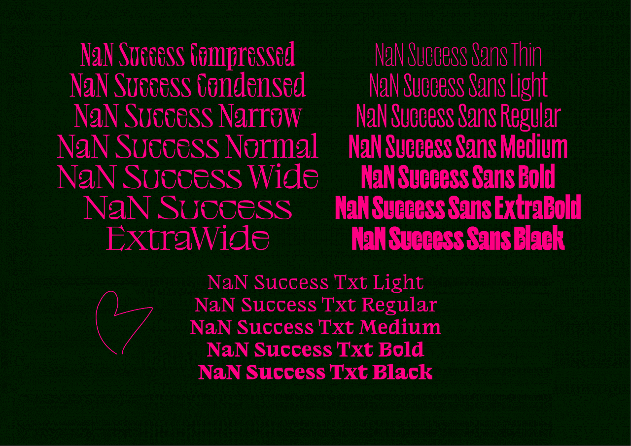


NaN Success is an essay on titling typography. The 3 sub-families — Success Titling, Success Sans & Success Text — all answer, separately and together, different questions and challenges raised by typography.
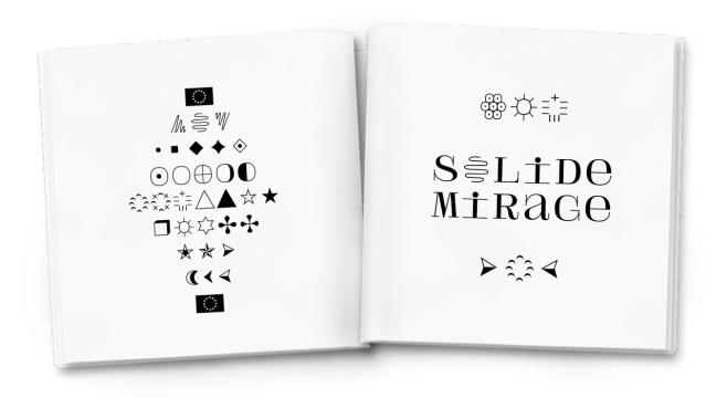
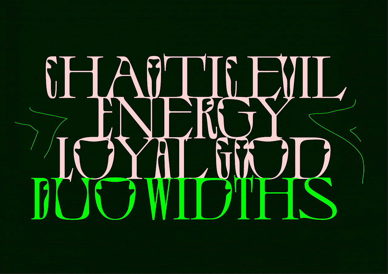
Drawing inspiration from late Art-Nouveau typefaces, De Vinne, Louis Jou, and mixing it with a healthy amount of alien goo, Jérémy Landes brought the master Success Titling sub-family to life. This display type is packed with an insane 280 number of ligatures, for both the Latin and Cyrillic scripts. In that, Success is a out-of-the-box tilting machine for designers. But because this wasn’t enough, Success Titling was augmented with innovative multi-width ligatures and alternates, meaning that compressed and wide glyphs are mixed in its ligatures, providing a inimitable hand-lettering feeling.
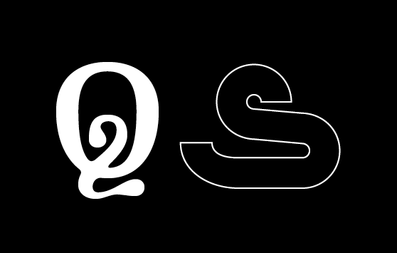
Success Sans takes the distinctive curves of its big sister but applies it more sporadically on a condensed gothic skeleton, mixing together industrial and organic inspirations. The Light style embodies a lace-like delicacy while the as-bold-as-it-can Black calls for both the forces of nature and hot steam, as a steam-punk golem.
Success Text brings a long-reader text-friendly horse to the family by taking everything that makes Success out of it while keeping the very substance, the bone mellow of its titling siblings. It takes advantage of the organic qualities of the family in a tuned-down fashion to deliver a very warm and comfortable text rhythm. Its low contrast makes it solid and confident even at small sizes, while its unique weight disposal brings a subtle personality to the paragraph.
15% or the revenue generated by Success will be donated to the NGO fighting for climate justice Client Earth. We offer a 100% discounted licenses for any project related to nature conservation, sustainability and environmental justice. Please get in touch with such project at info@nan.xyz.
Additional Production by Fátima Lázaro
Spacing and kerning by Igino Marini
Promo video by NotNotGood