Millimetre


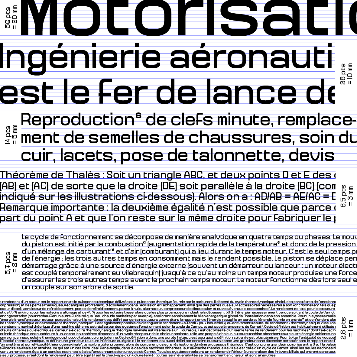
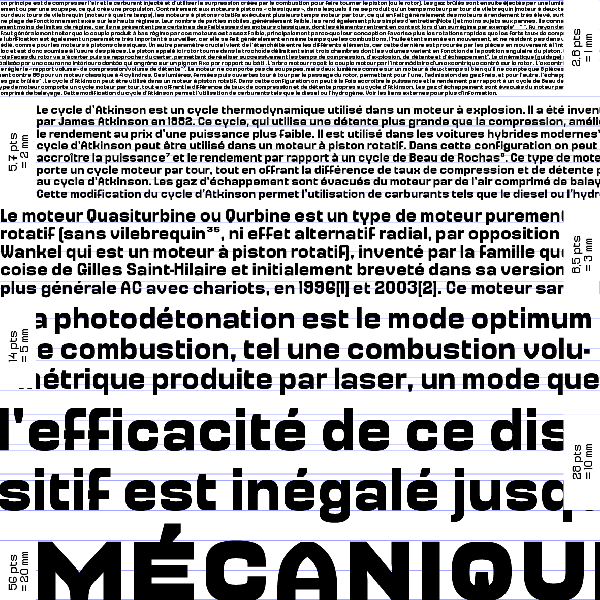

Millimetre is a series of fonts constructed on a grid based on the metric system. It follows the decimal logic of the latter. In this spirit, when you typeset Millimetre, please don’t use the archaic unit of the point but the millimetre, centimetre, decimeter or the meter itself for the really big sizes.
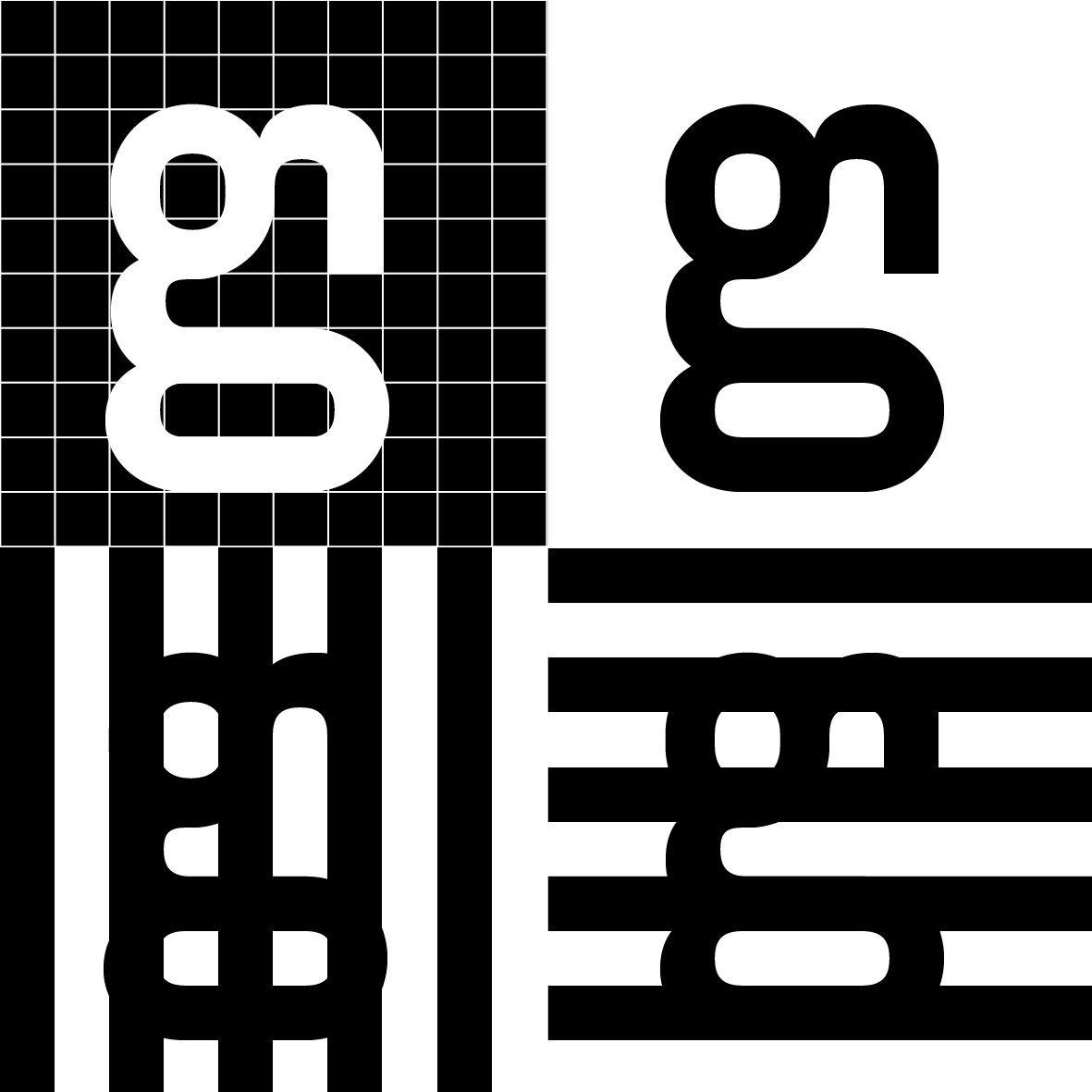
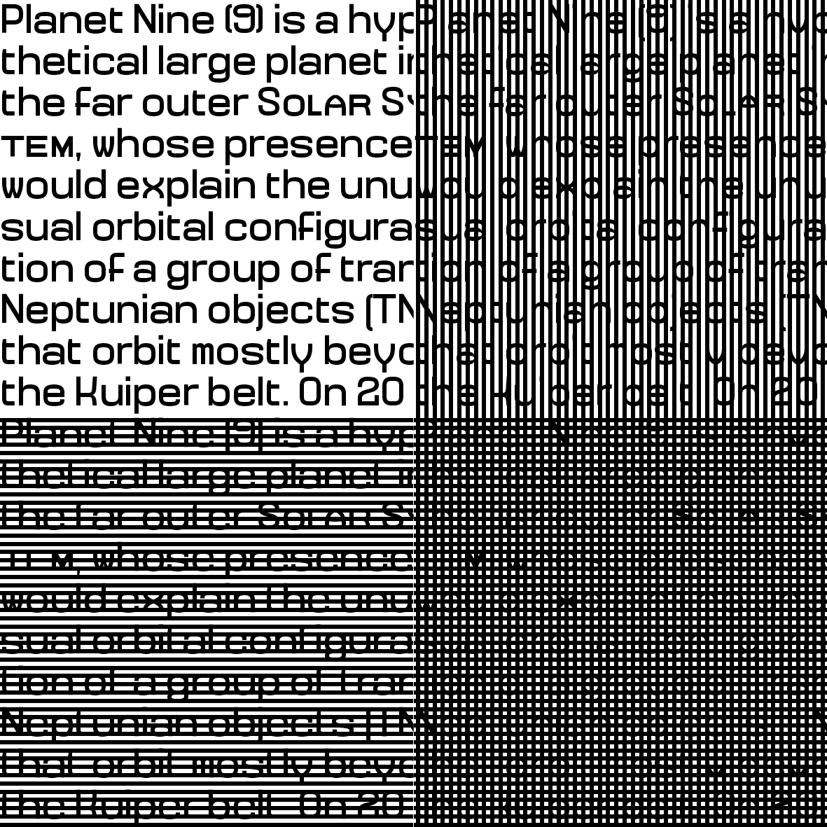
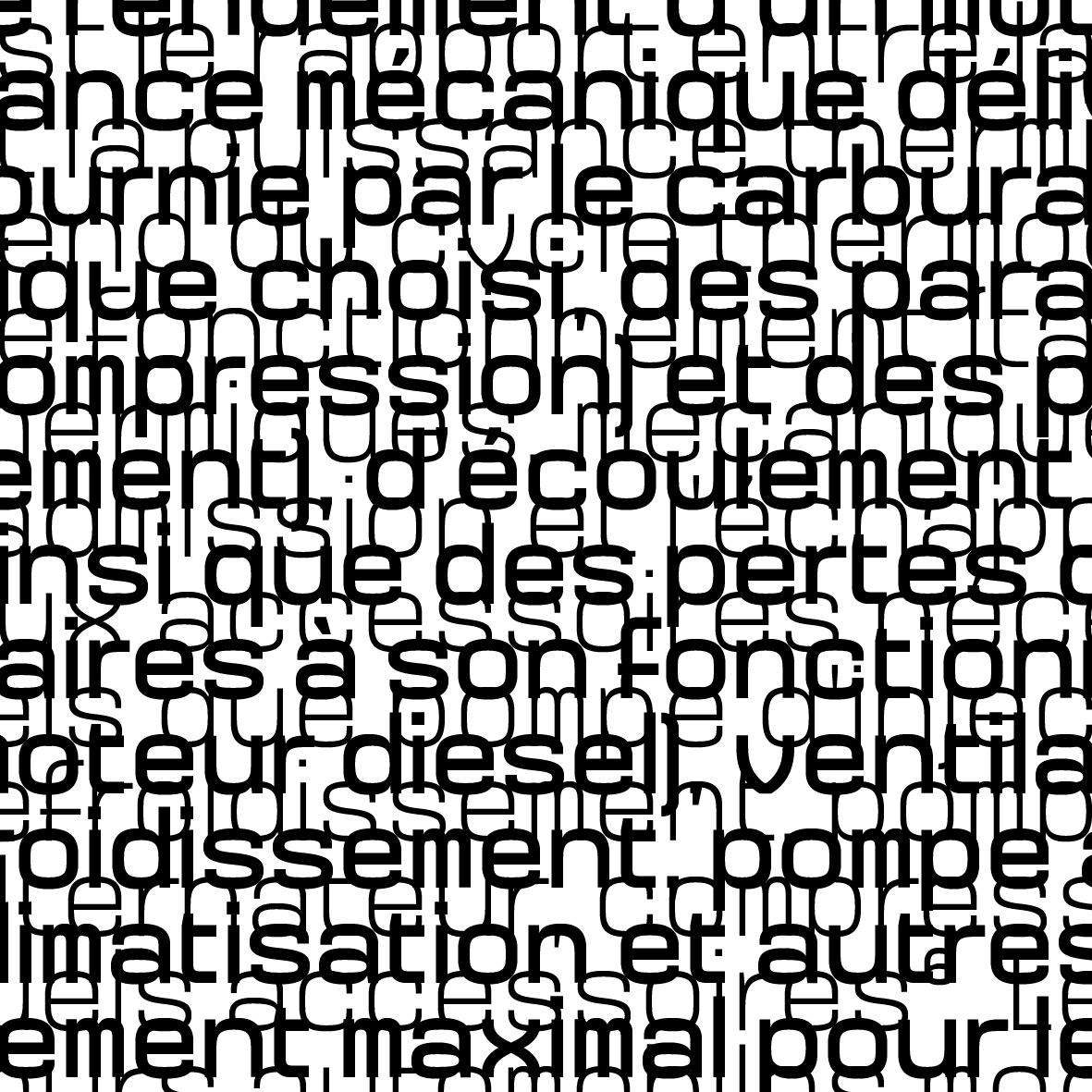
In this typeface, each em-square is vertically and horizontally divided in 10 units (decimal, remember?). Printed at a 1 cm size, the strokes of the regular weight will be 1 mm thick. Both white spaces and black stems fit on this grid. Half of the lines and columns of this 10x10 grid receive the stems and the strokes of this font whereas the other half is there to receive the white spaces inside the letters and between them, making millimetre rythm quite unique, totally settled, like a barcode. To make it clearer, when you typeset two m lowercases, the thickness of the stems of the m will be equal to the counters between its legs, to the thins and to the space between the two letters. This grid-based design, aligned to a pixel grid, makes Millimetre works quite well on screen too. When typesetted with a leading equal to its size, the grid appears in the perfect alignment of the stems between the different lines of text. No corrections needed.
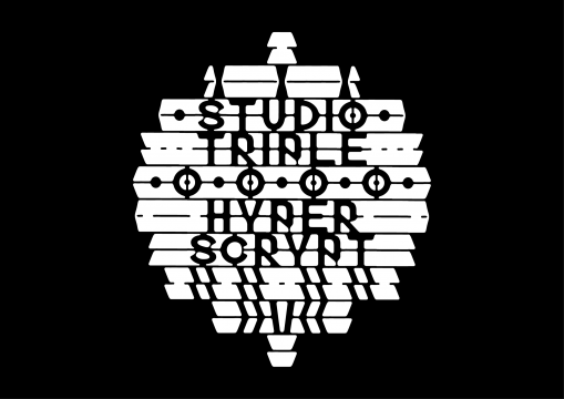
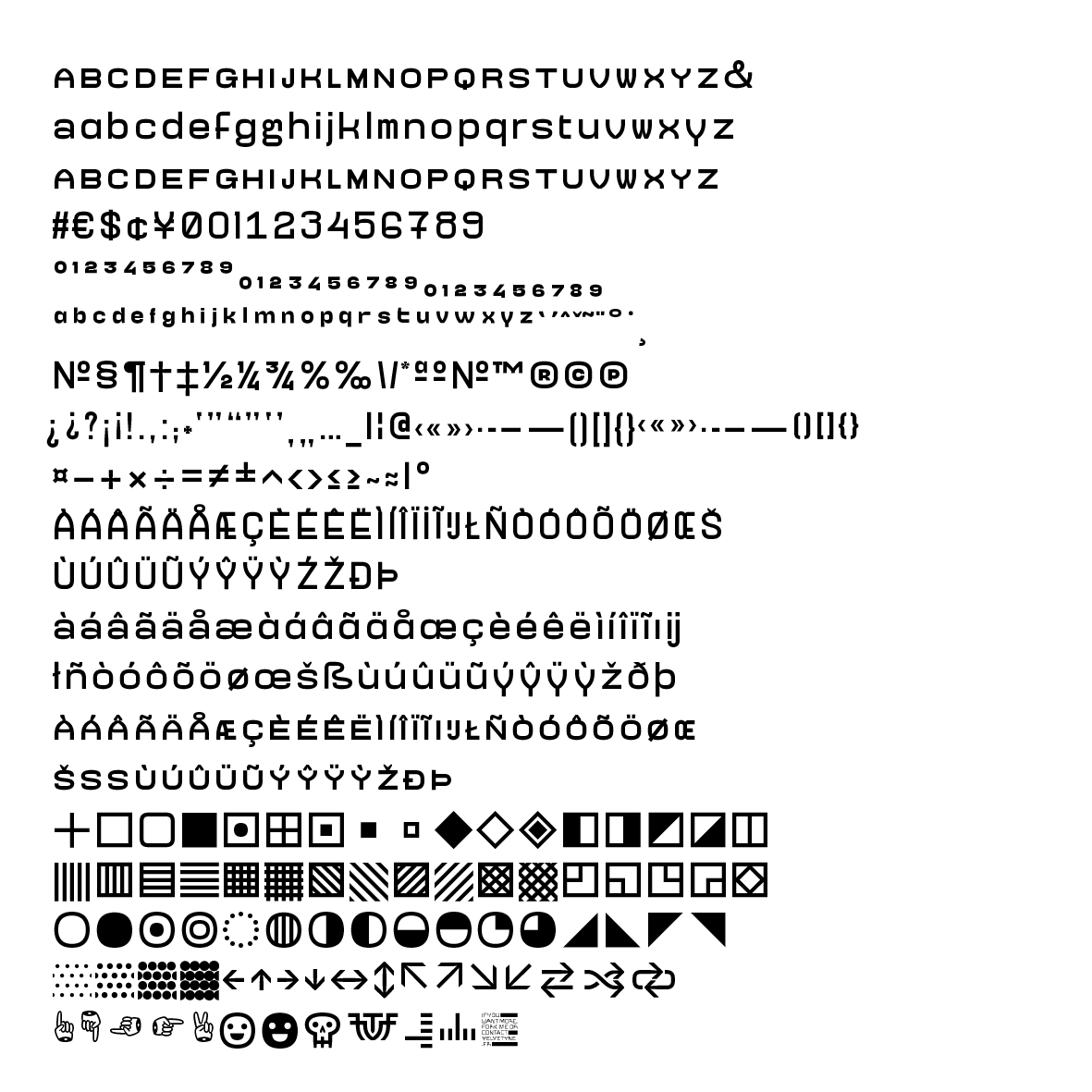
From a stylistic point of view, Millimetre is a geometric, constructed sans serif, with quite wide proportions even if the width of several glyphs could contradict this statement. With its rectangular look and closed terminals, Millimetre reminds us of 60’s sans such as Aldo Novarese's Eurostile. Far from running away from this graphic universe, Millimetre embraces the retro-futuristic, architectural, technological and science-fictional connotations that come with it. Due to the grid on the top of which it's constructed, the rhythm of this typeface can remind us of the one created by a monospace. Even though it shares a certain regularity in the widths of its glyphs, Millimetre isn't a monospace, it creates is own grey. Began as a truly monolinear sans, the drawing of this typeface is finally more subtle, with thinner stroke joins and tiny variations of weight to balance the shapes. This becomes even clearer in the bolder weights where some thins appear in several glyphs to avoid making them too dark regarding the rest of the font.
If the regular never leaves the grid, the other weights are more sensible whereas keeping a really close rythm. Millimetre Bold is 1,5 times bolder than the regular and the lighter weight will be half the one of the regular. Set together, the different weights share the same grid and allow to create a constructed layout altogether. The system never gives up.
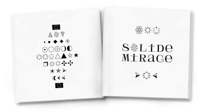
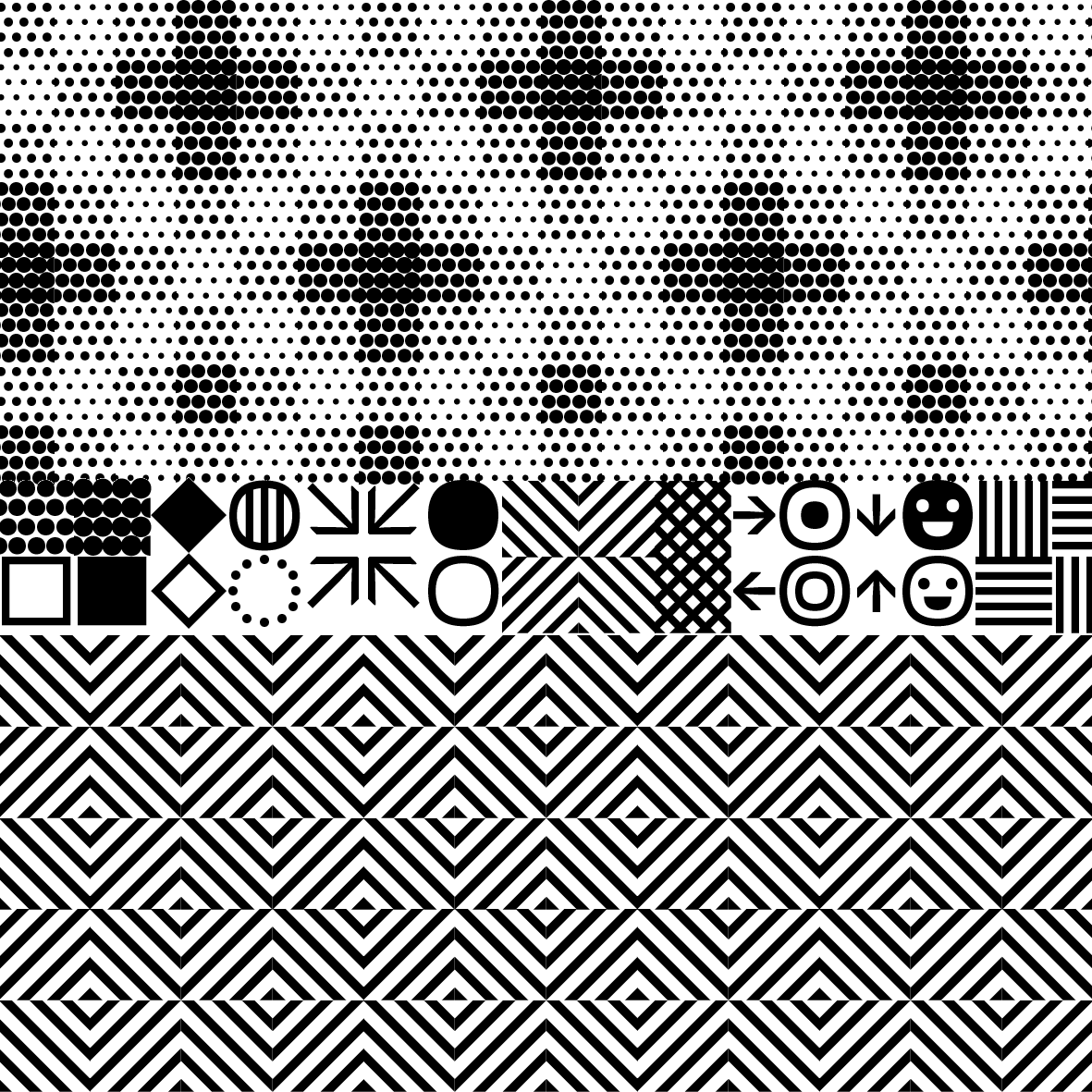
Finally, this type family comes with a wide range of technic and geometric ornaments allowing to create patterns dialoguing with the text. These ornaments are inspired by the early age of the computer era and by the technical graphs used in the printing business. Therefore, they can be really useful to layout technical documents, maps, or to accompany and put the emphasis on the technological look of the font on graphical documents.