Food Society
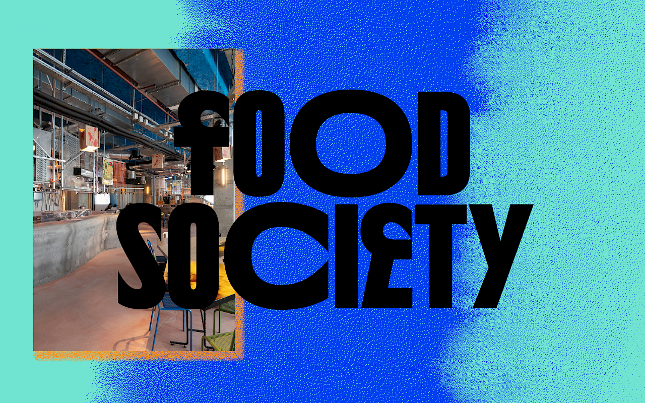
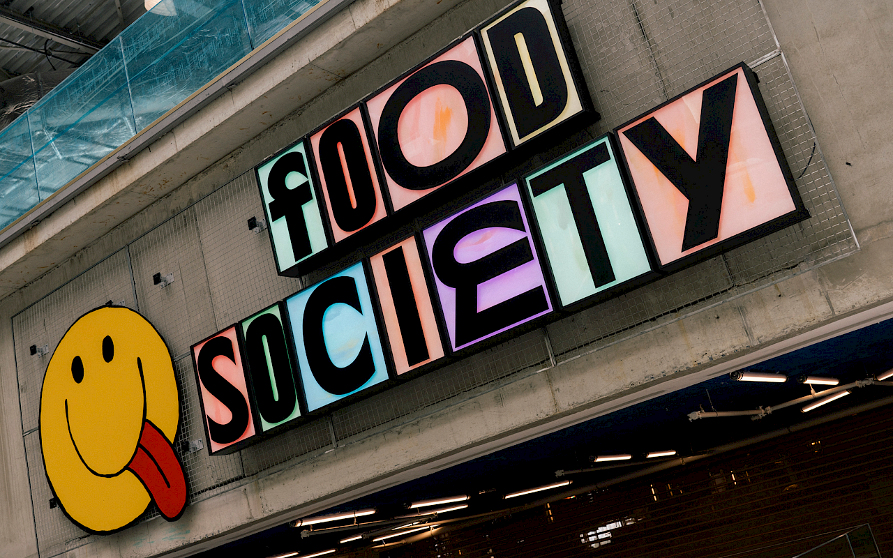


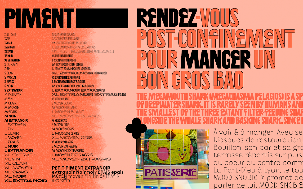
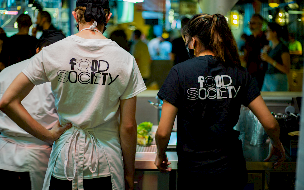
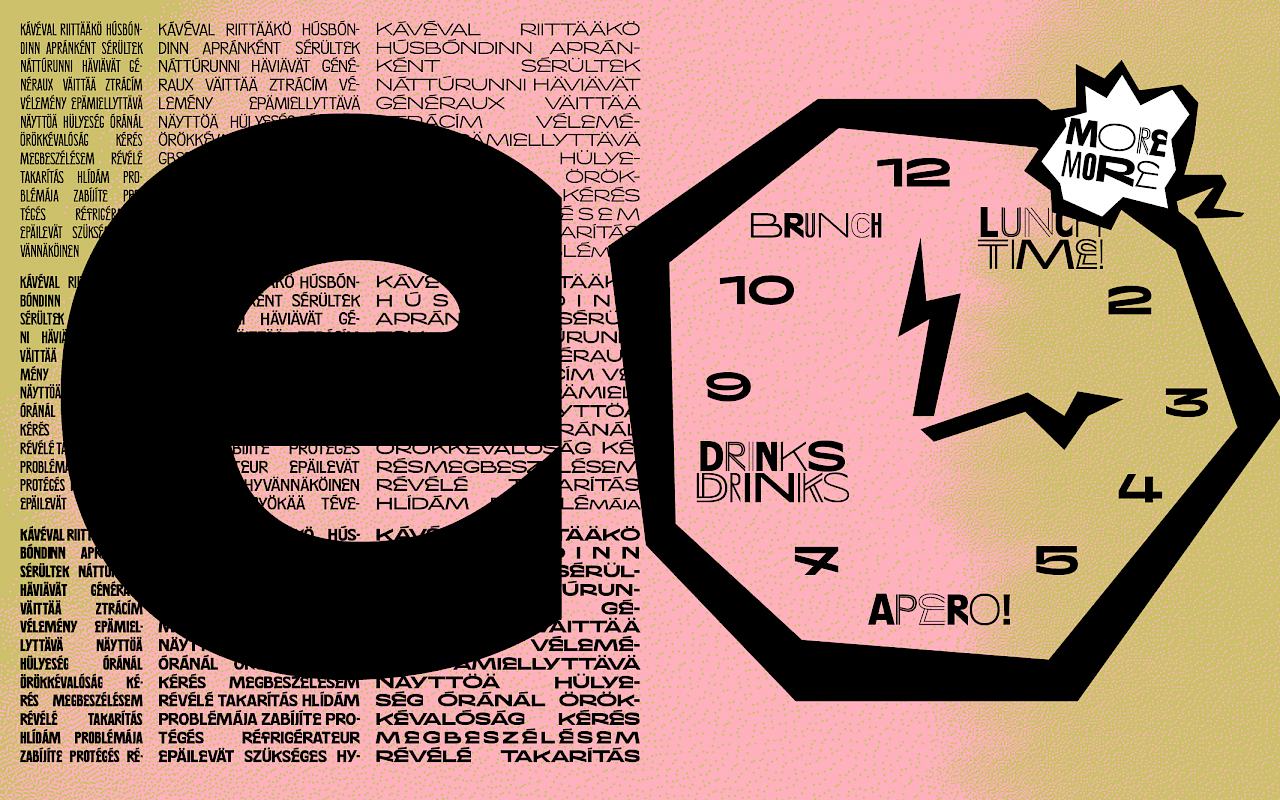
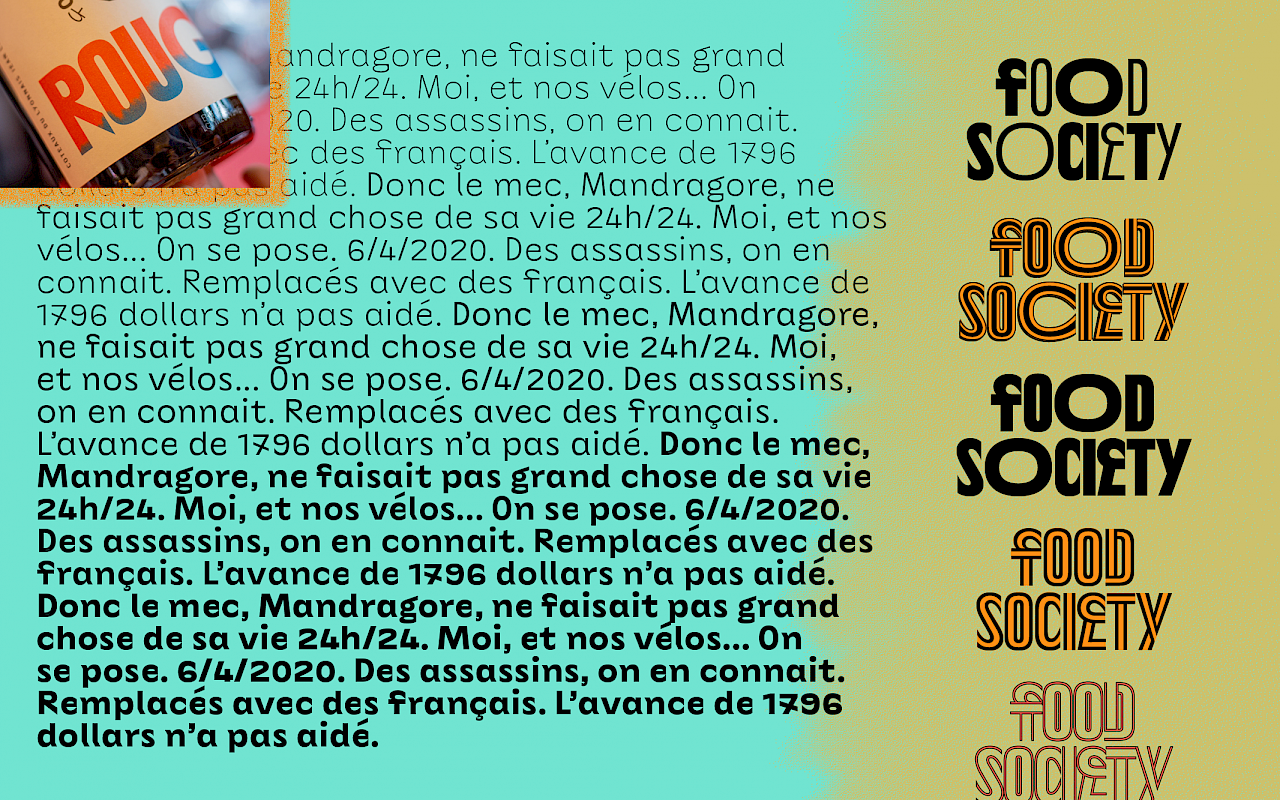
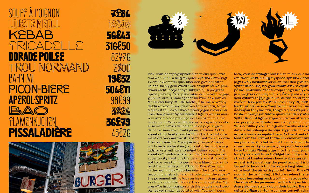

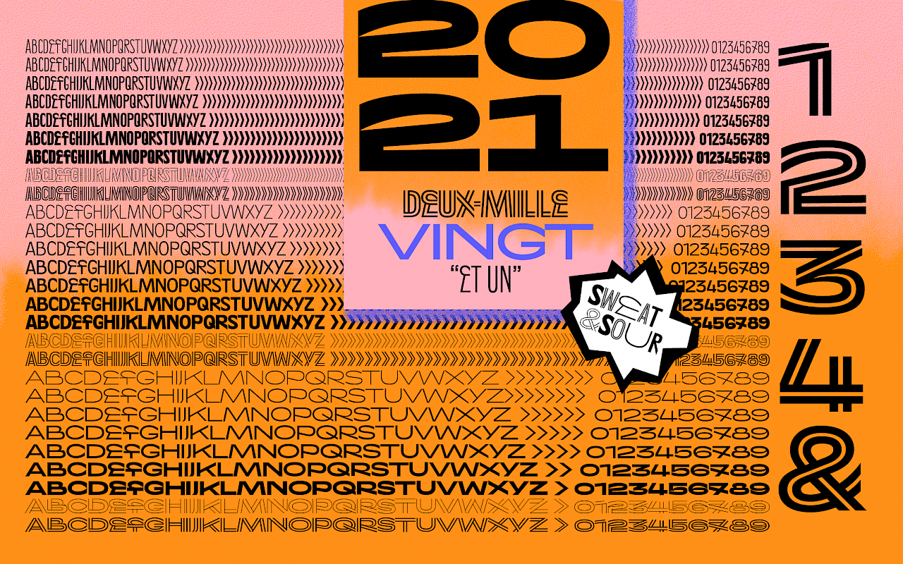
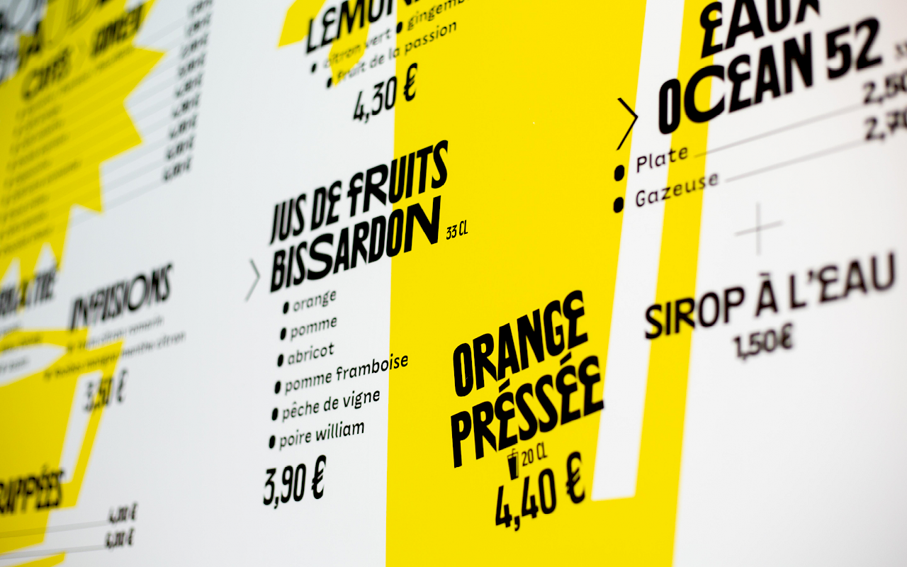

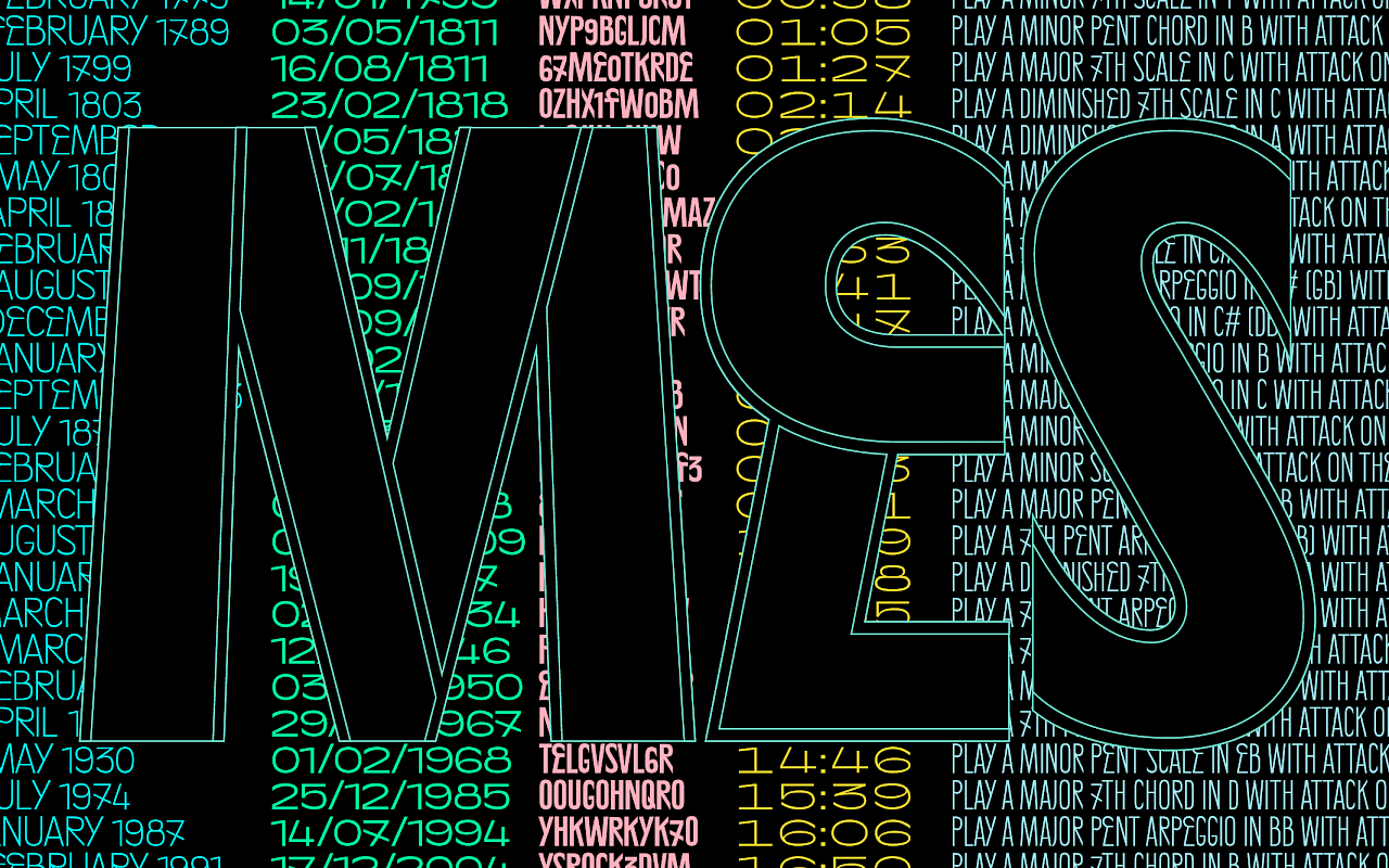
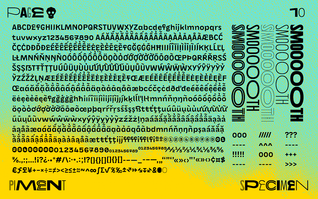
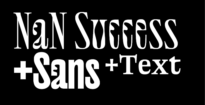
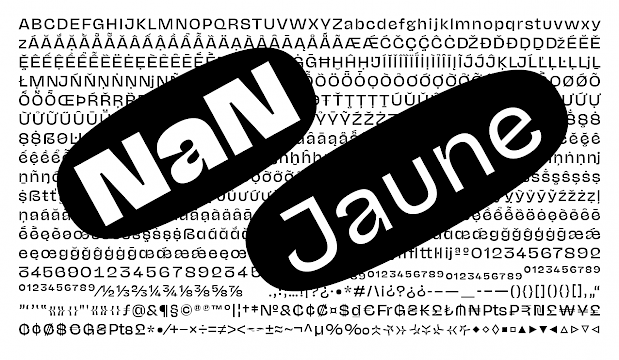
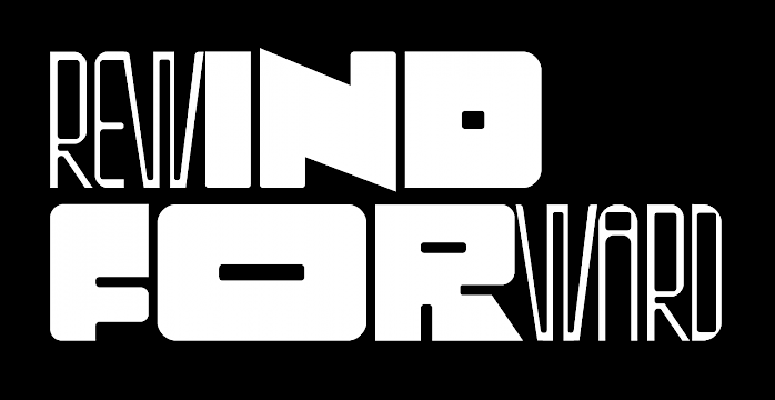
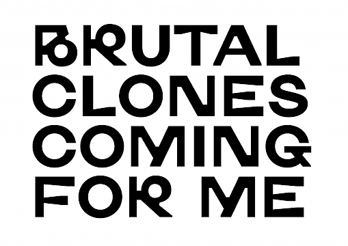
For the identity of the food courts company Food Society, we developed in close collaboration with AAAAA Atelier a two-headed type family, including 65 titling styles and 6 text styles. The aim of these fonts is to provide enough flexibility to deploy themselves across different locations (now one place in Lyon, soon 2 more in Paris) with slightly different tones of voice. The all-caps titling family is set up across a wide range of widths and weights together with outline styles that also span across multiple weights. Combining the outline styles with the plain ones allows for multi-color type-setting. The typeface mixes inspirations from Art-Deco and street-art in a playful and irreverent way.
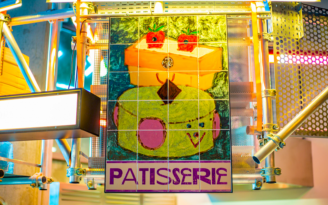
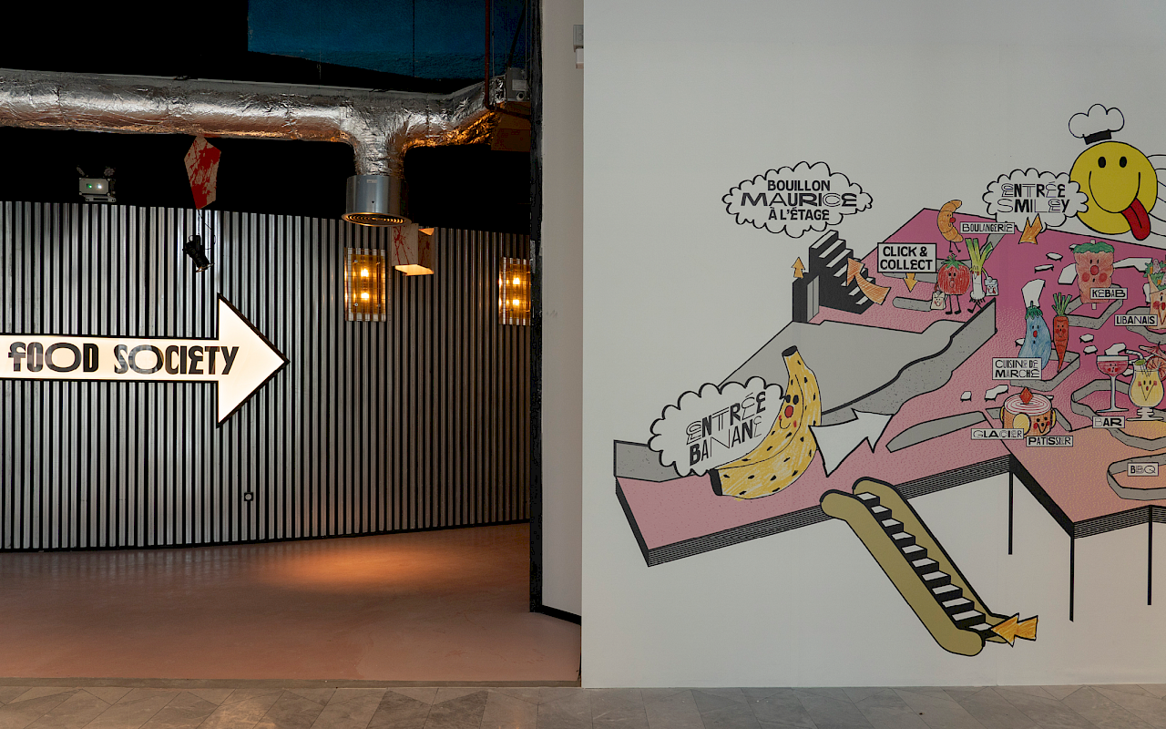
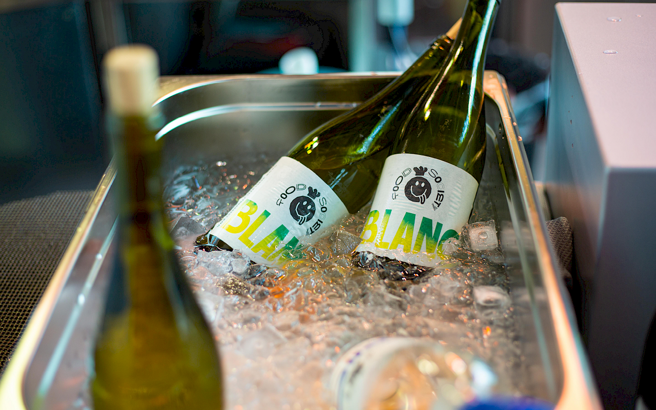
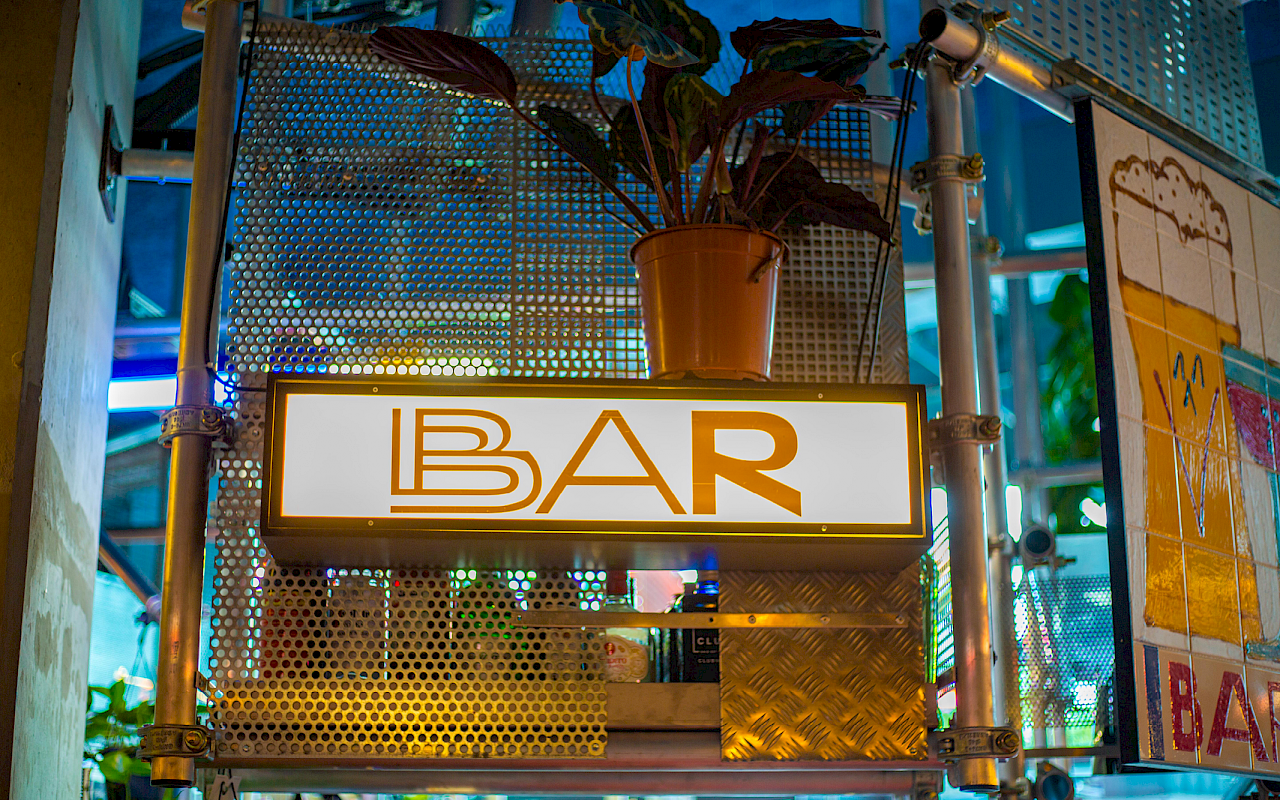
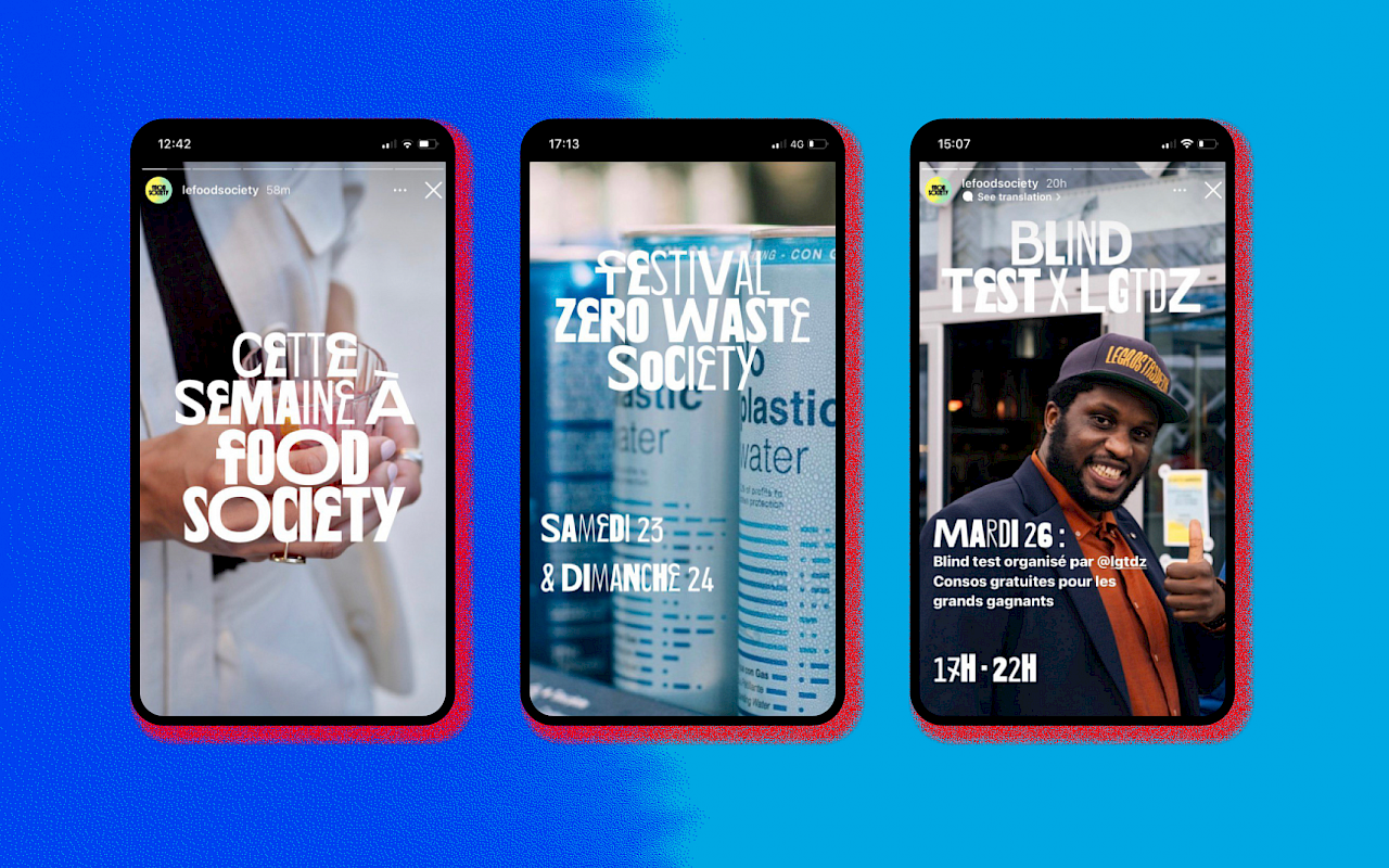
The fonts are used for signage and packaging all over the place, painted on Ceramic tiles by Ceramic artists Mon Colonel & Spit, and part of the distinctive architecture. The identity makes a good use of variable fonts through animated logos and a website randomly flexing all the styles of the fonts when users over titles.
Note: the text sub-family will be released as a retail typeface with a slightly modified design in a near future. Drop us an email if you would be interested by an early access.
Art Direction by AAAAA Atelier
Pictures by Julia Grüßing
Ceramic art by Mon Colonel & Spit
Architecture by Lionel Jadot
Spacing and kerning by Igino Marini