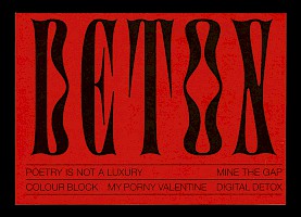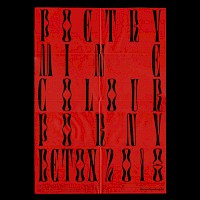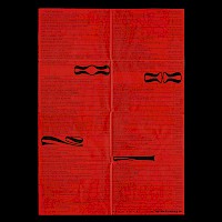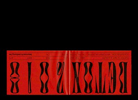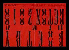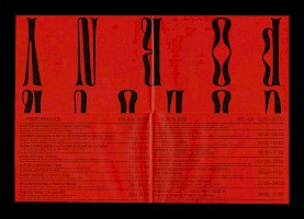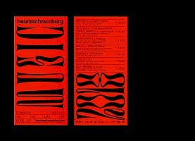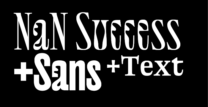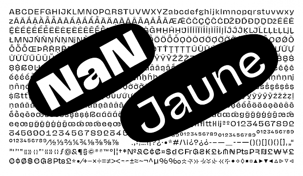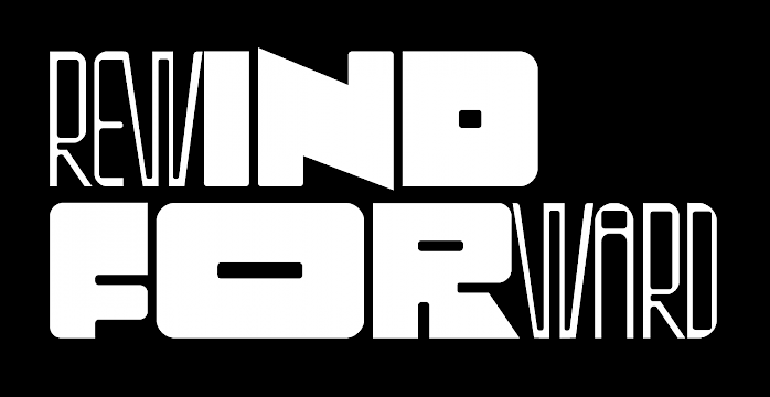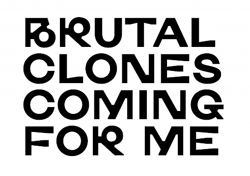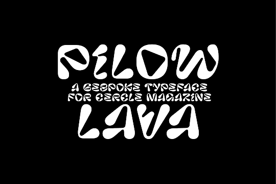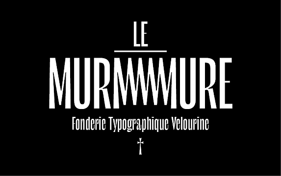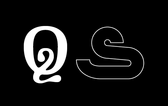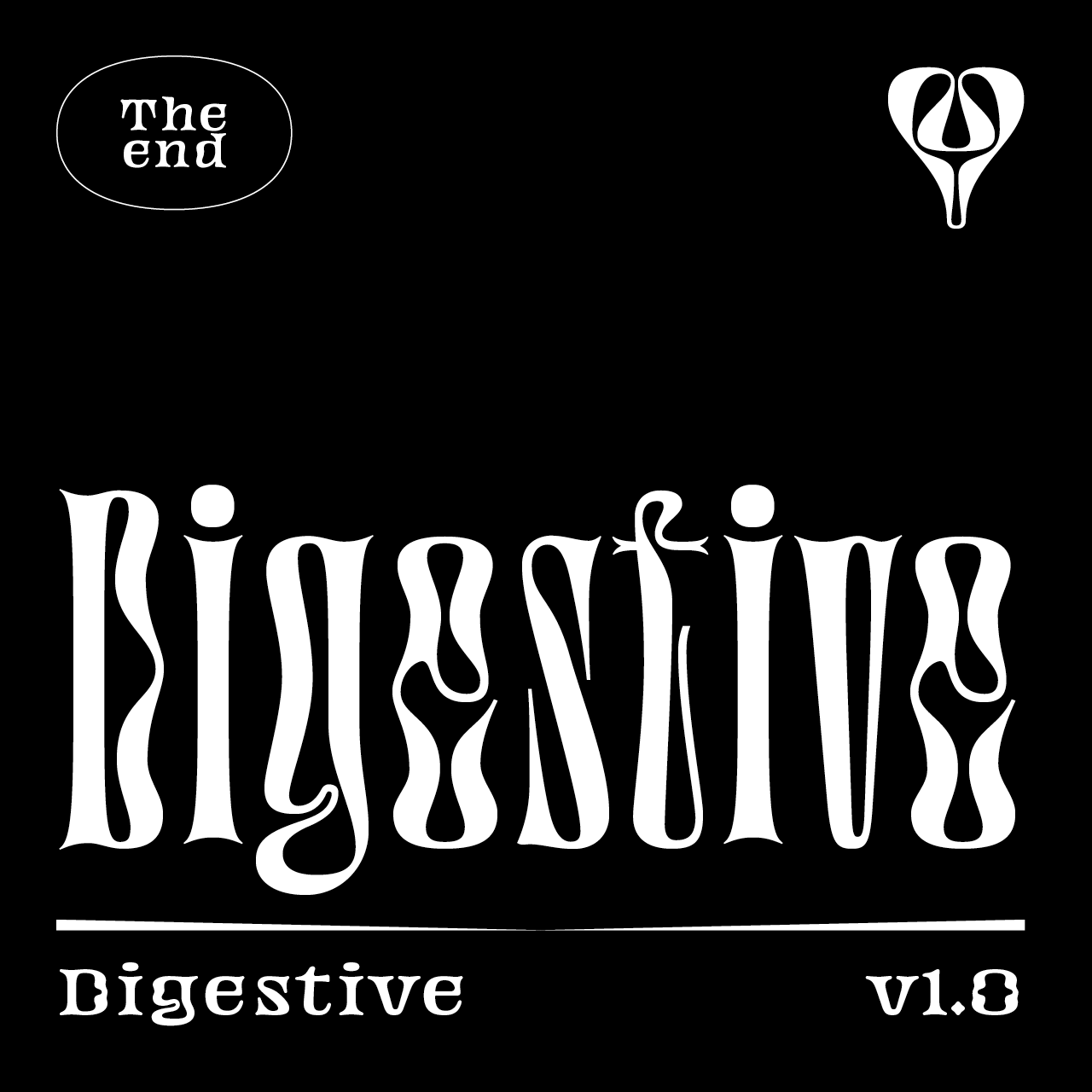
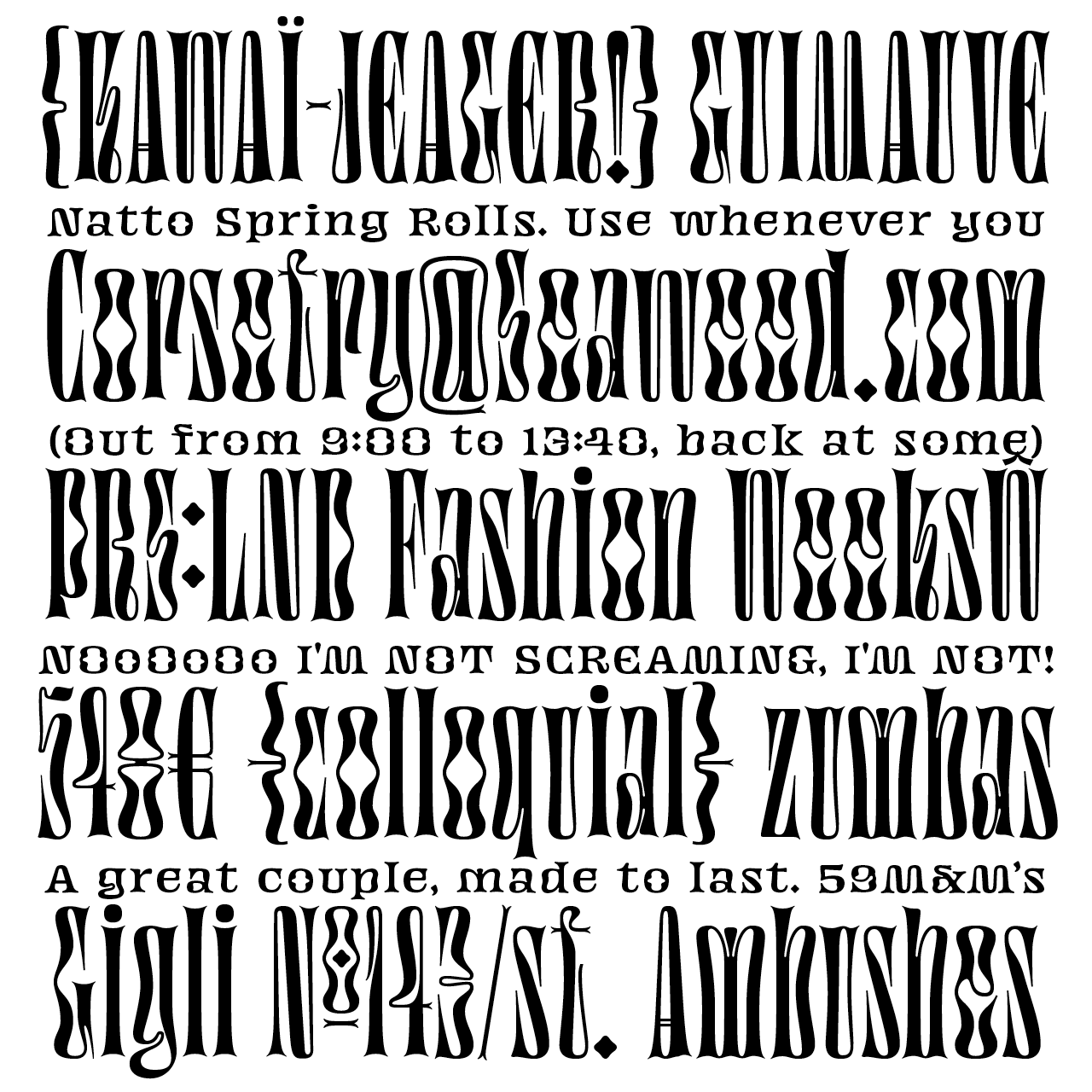
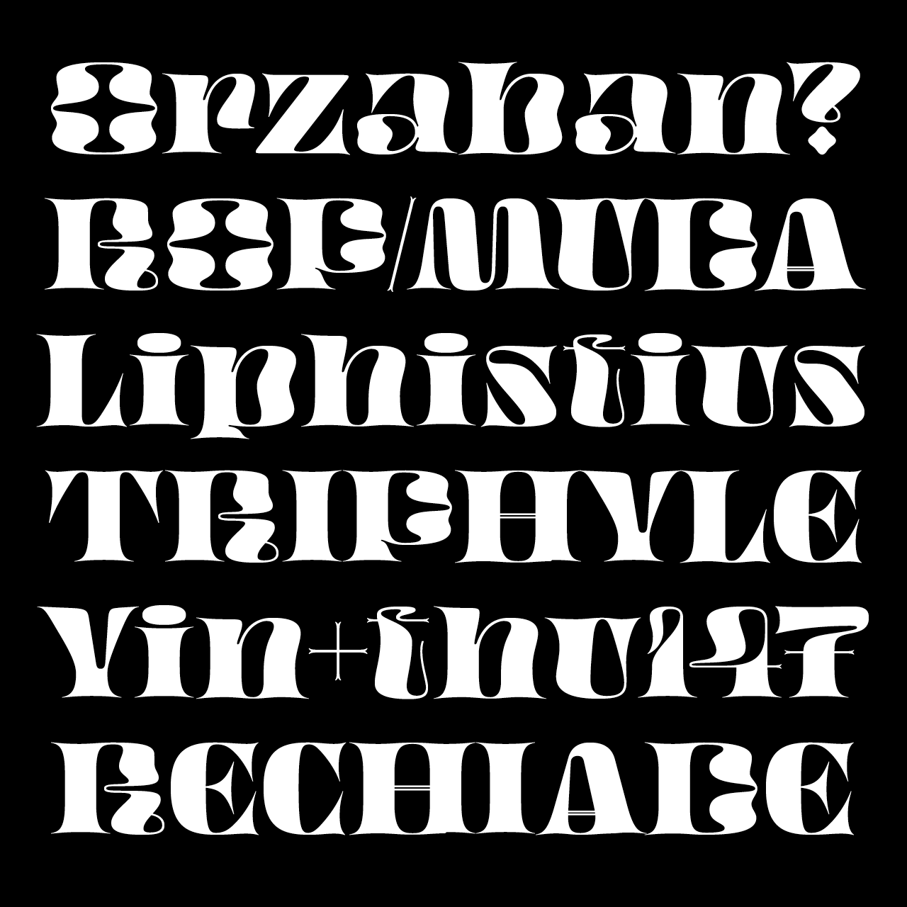


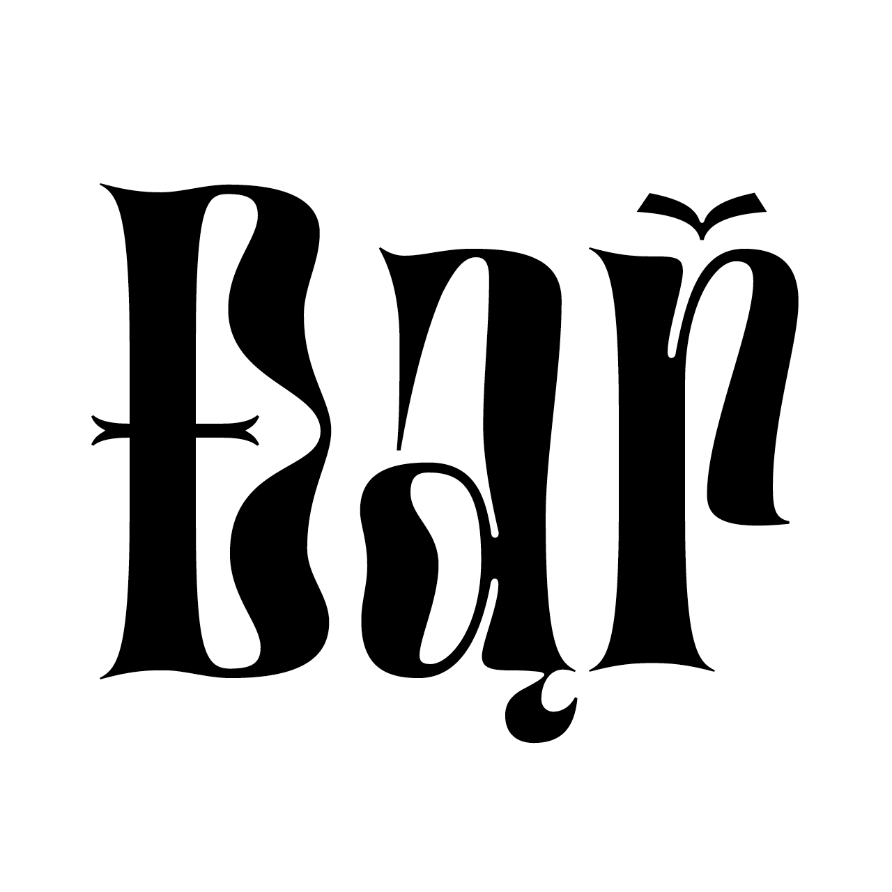

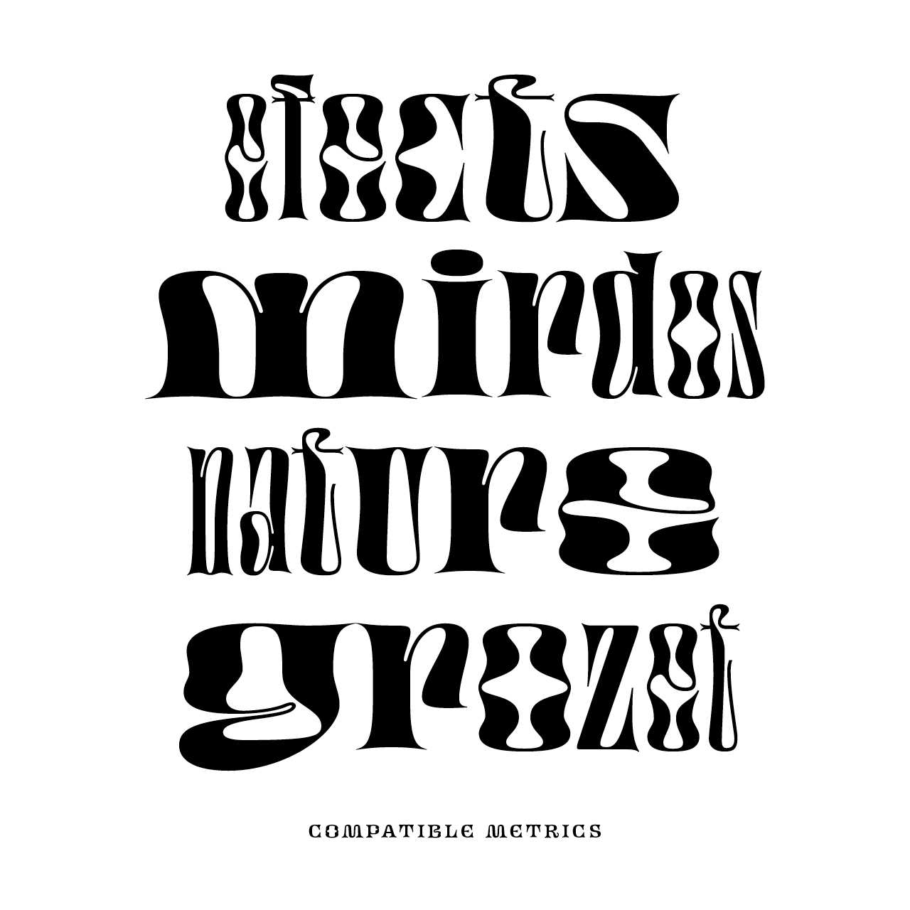

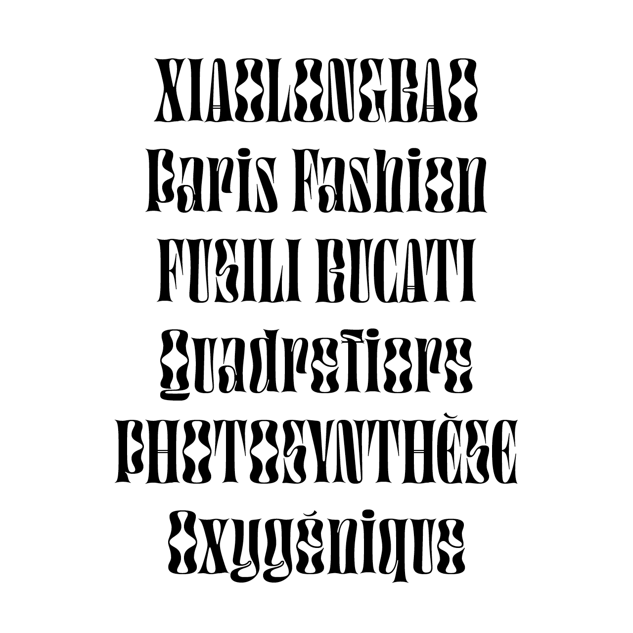
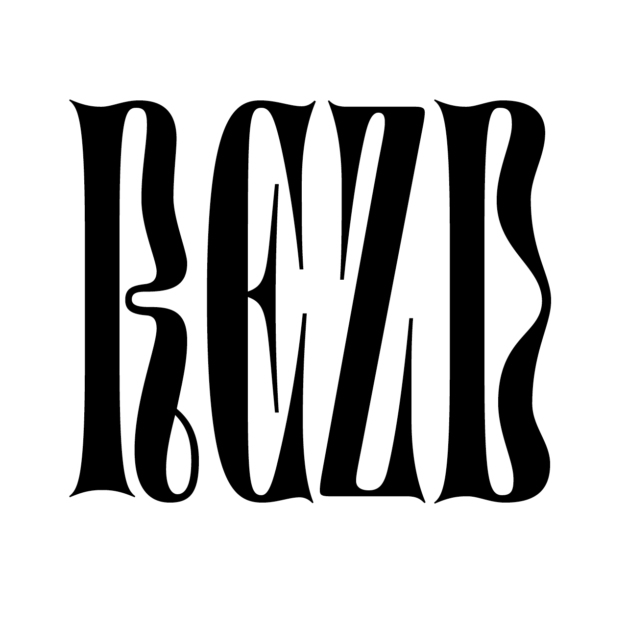
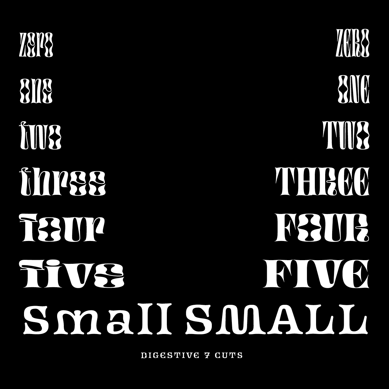
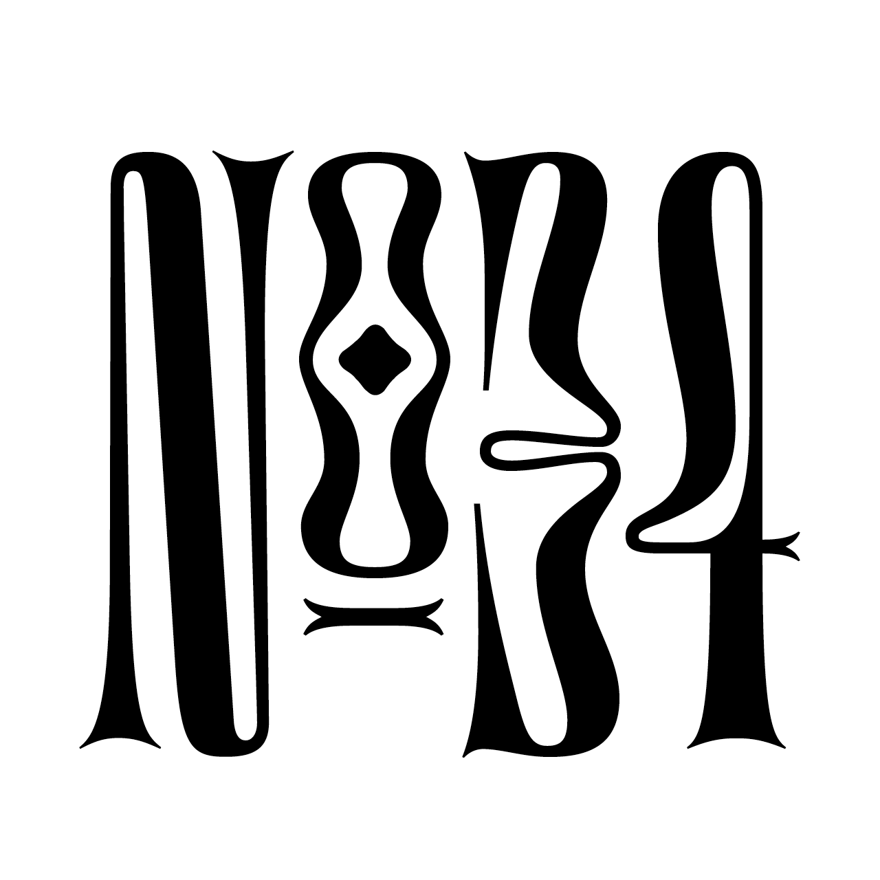
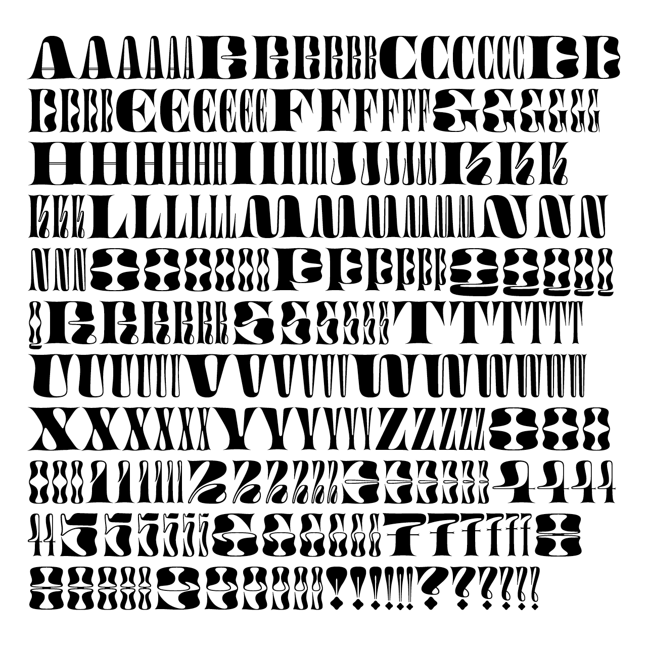

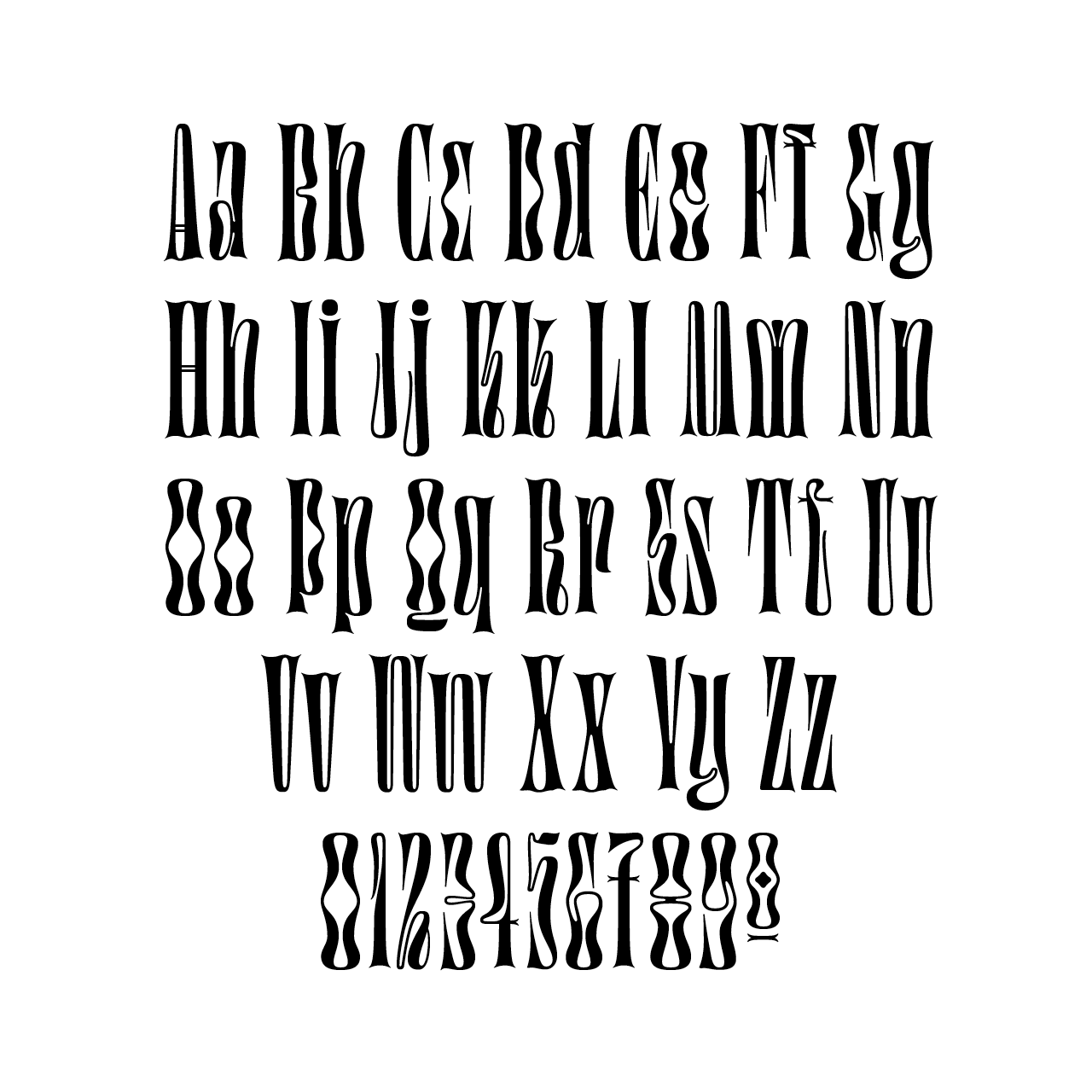
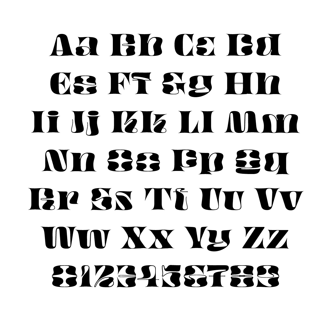
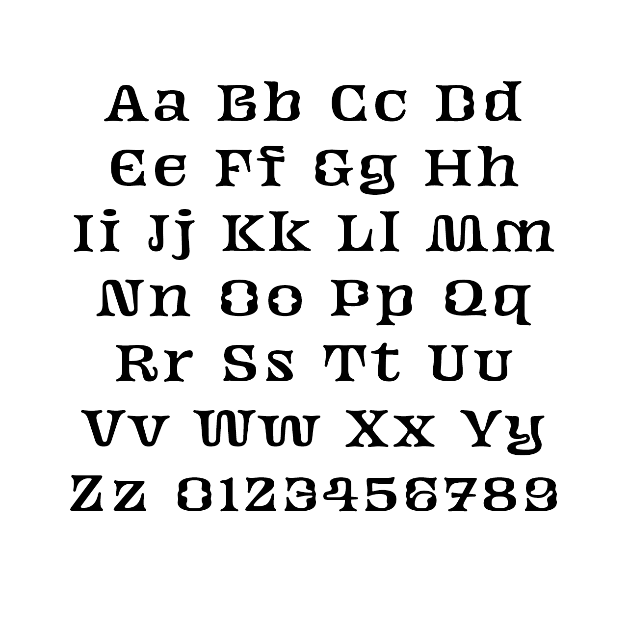
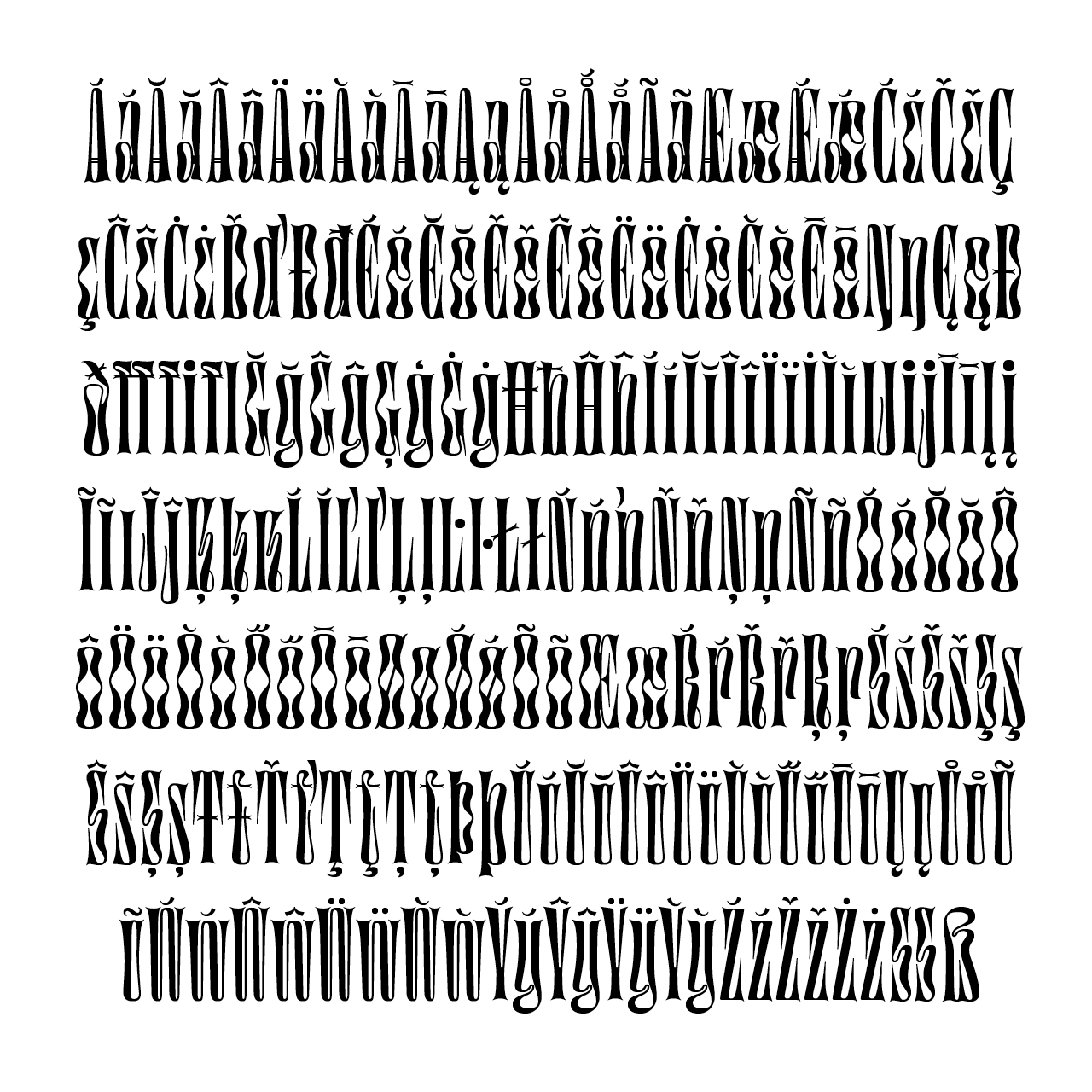
Taking inspirations from outside the typographic world, Digestive borrows shapes from the submarine universe (mainly seaweeds) and from anatomic parts, organs and guts. While designing this typeface, I tried to make a balance between something attractive and repulsive. This made me add some food related inspirations as I cook a lot. Call it long Italian pastas with a sticky sauce for example. Hence the name, Digestive.
As I was drawing it, I played some long hours to the video game The Binding of Isaac. Its seedy universe has surely a lot to do in Digestive consanguineous letter shapes.
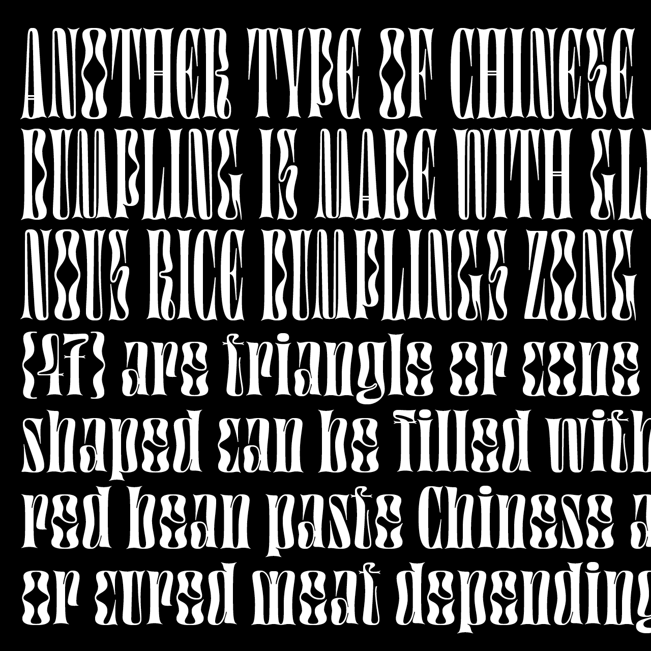
Considering its tall proportions, Gothic / Art Nouveau inspirations, fluid shapes and under construction process, Digestive could be seen as the humble typographic cousin to Catalan architect Antoni Gaudí's Sagrada Familia. We all hope that it will be finished before its eldest.
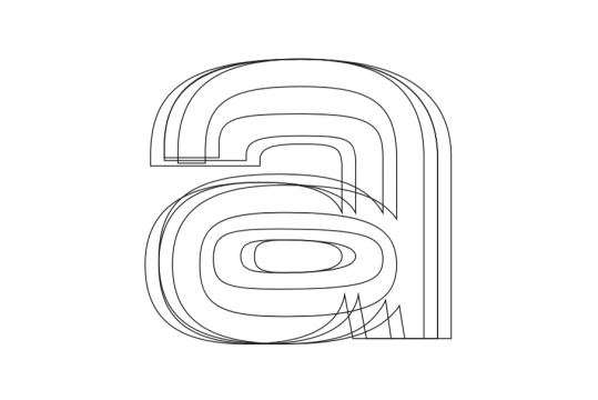
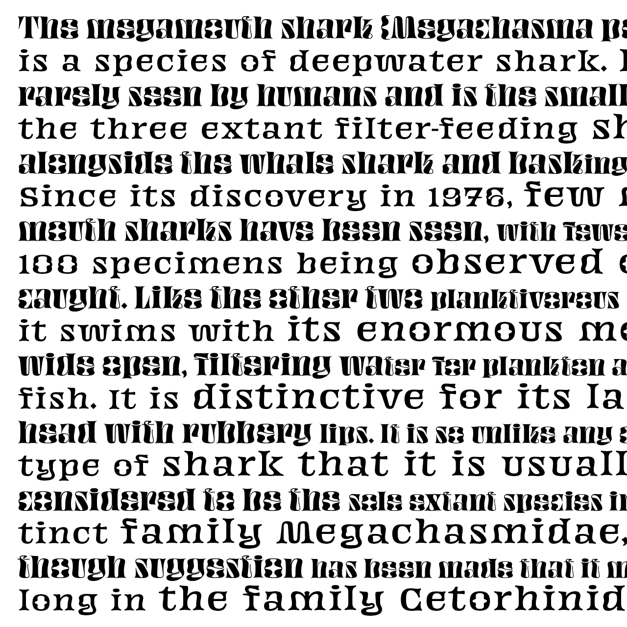
At first, I thought that I couldn't draw lowercases as strange and with a grey matching the uppercases but they came to me some months later. Now they seem essential. Started as a one cut typeface (the compressed width), Digestive is now a small family of 7 members, going from a super compressed width to a wider one, with a constant overall weight and matching side-bearing. A new companion meant to be used for smaller sized text has just been adopted by the family. Its name? Small, indeed.
Use it big, and don't hesitate to add some letter-spacing when used tinier to help the legibility.
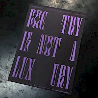
(Anecdotally, Digestive started as a lettering for a poster about George Sand's book La Mare Au Diable.)
A specimen in the shape of a scarf has been made for Digestive. Have a look at it.
Digestive got featured in Typographica's favourite typefaces of 2017. Read the article.
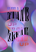
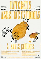
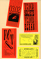
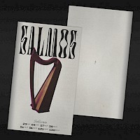
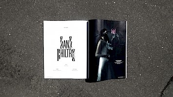
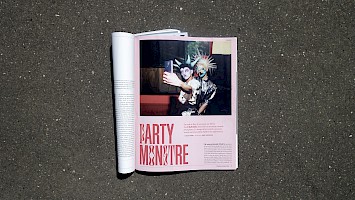
Digestive in use
Protection
Leslie David


Intérêts agro-industriels
Guillaume Lavezzari
Toner Societe Toner Ecran
Félicité Landrivon
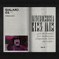
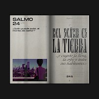
Salmos
Diego Moratalla


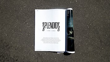
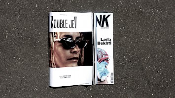
Citizen K
Thibault Conan
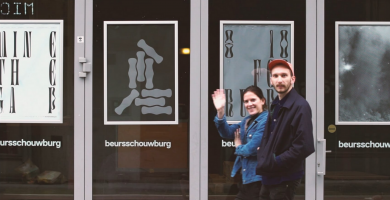
Beurrsschouwburg
Atelier Brenda
