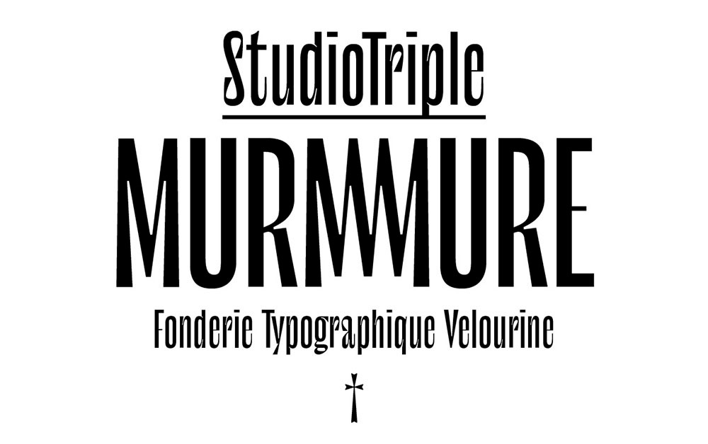
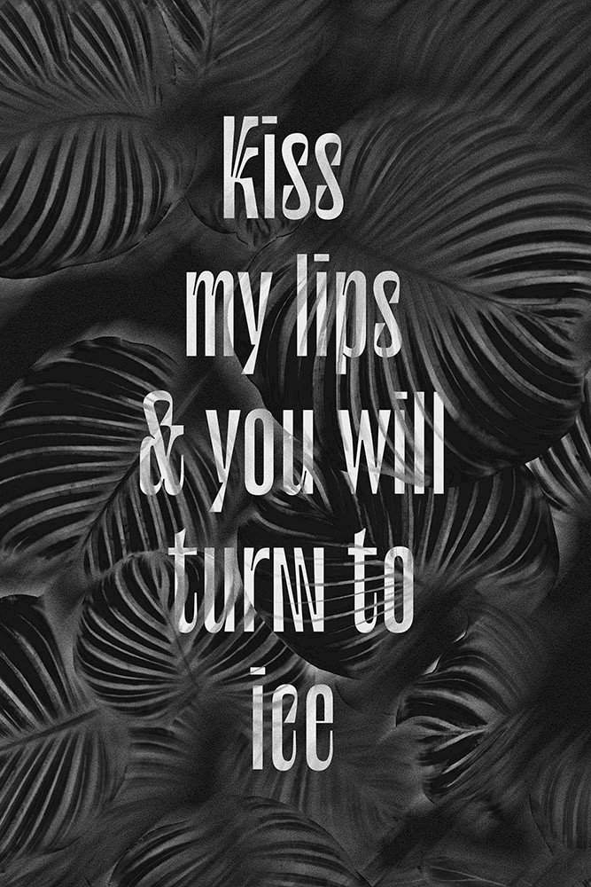
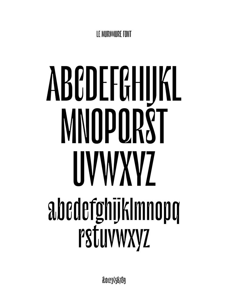
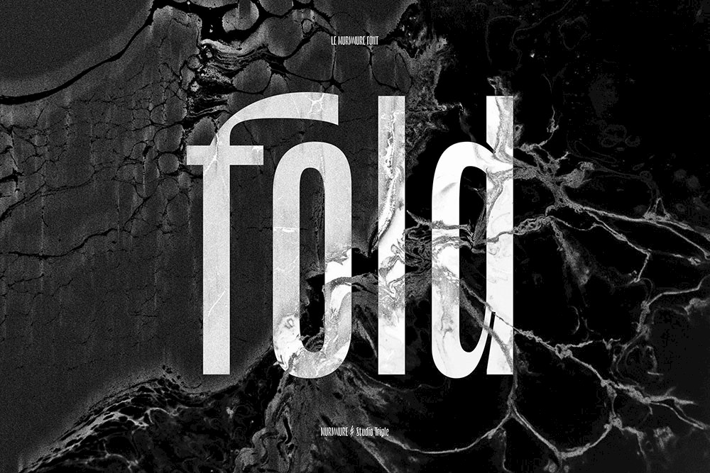
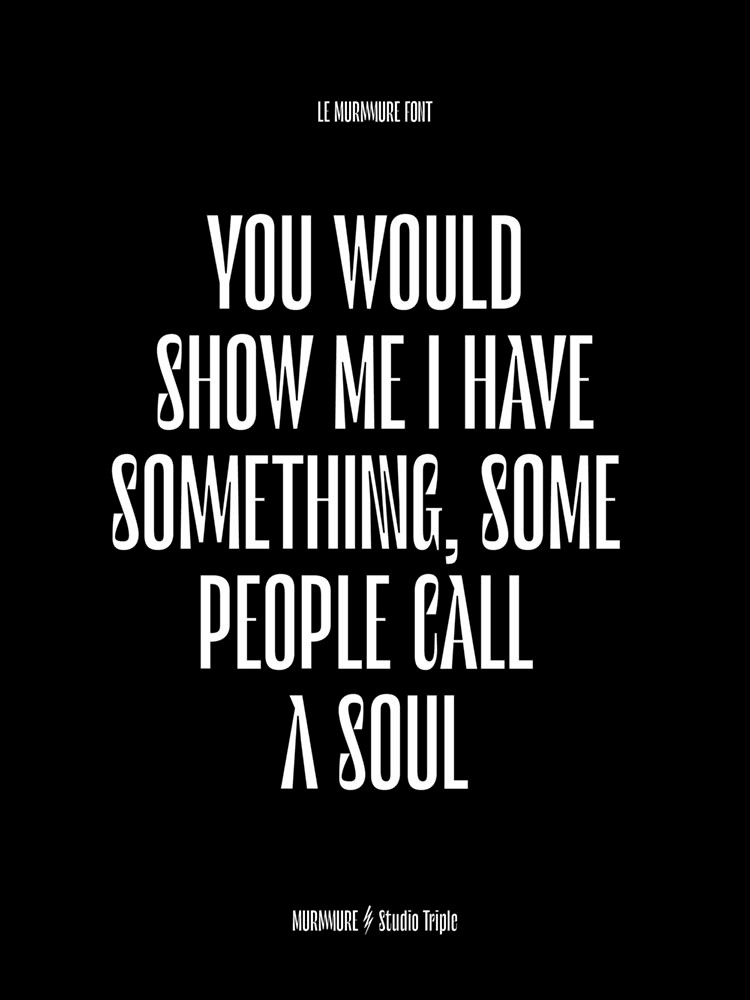
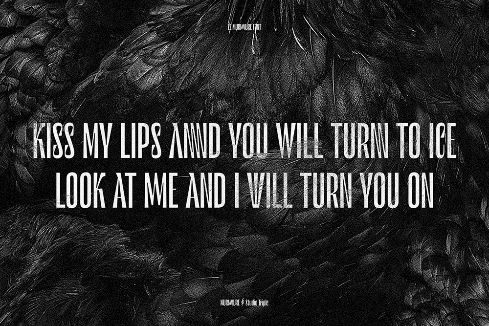
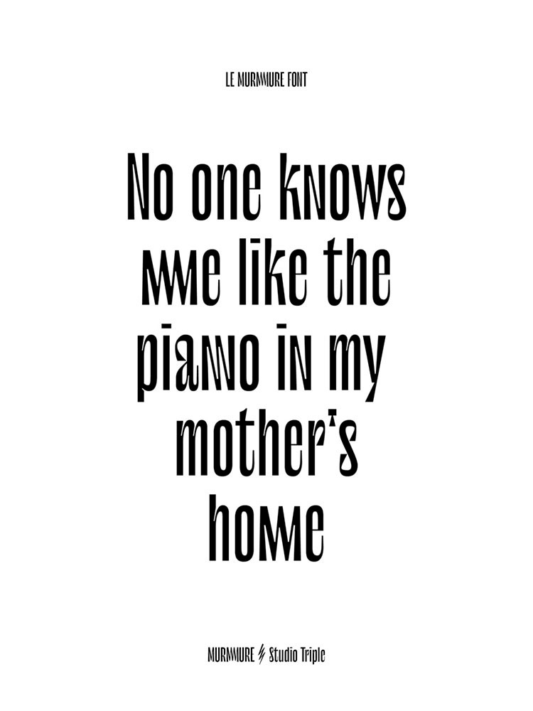
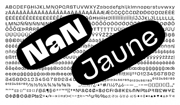
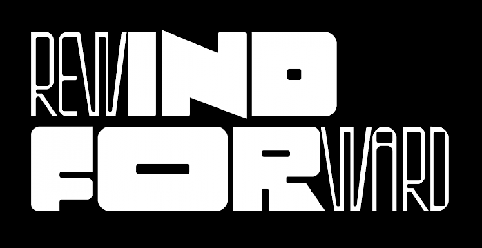
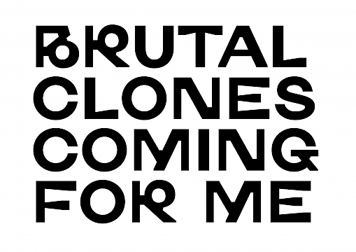
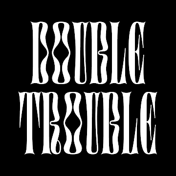
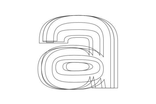
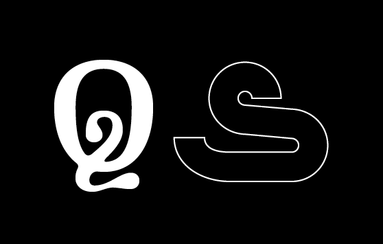
To renew their brand image, the French design agency Murmure has decided to base their remodeling on a custom-designed typeface: Le Murmure (“The Murmure” in French). We have developed an especially distinctive, editorial and elegant font, which has been complemented by surprising stylistic variations.
Jérémy has lent an attentive ear to create a typeface in line with Murmure's image. Le Murmure font plays on a skillful mismatch between characters, creating a unique rhythm which carries our voice. This fruitful and enriching collaboration strengthens Murmure’s graphic and collaborative vision to undertake singular and sensitive projects.
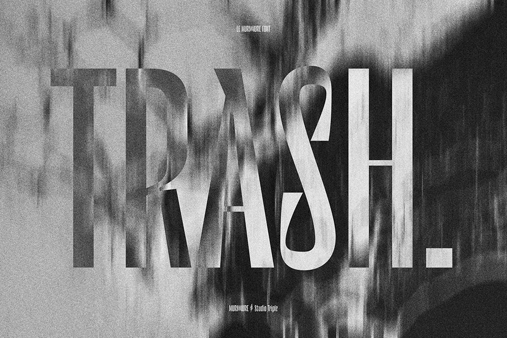
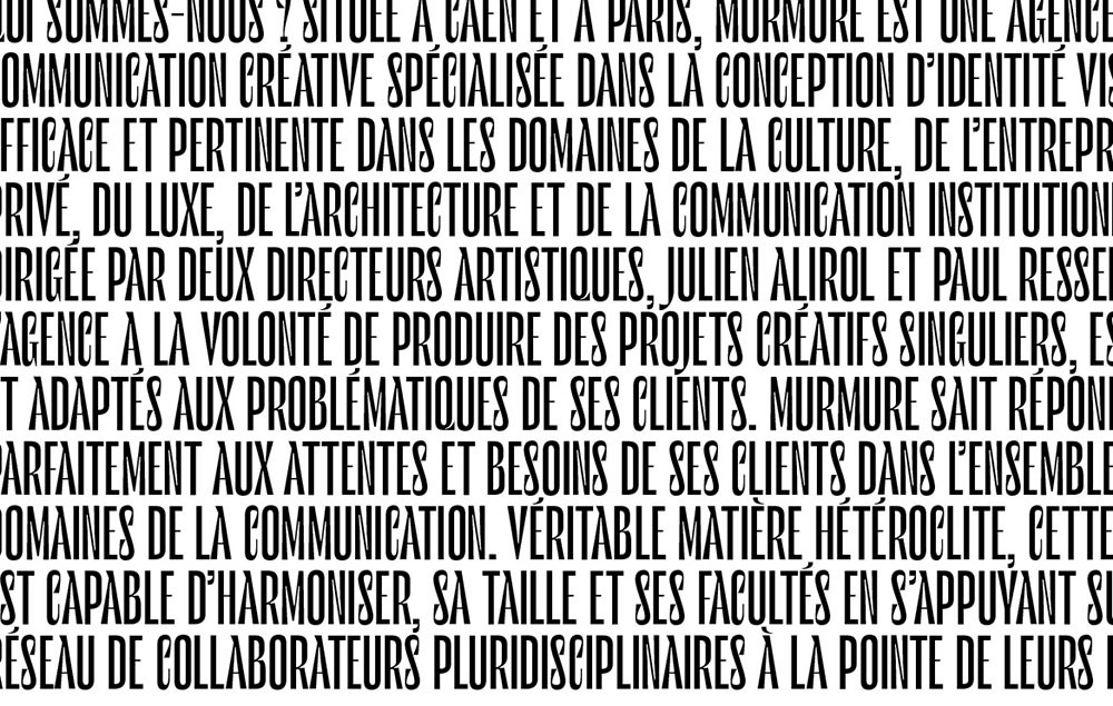
Used as a titling font, its height and the stability of its shapes lend it elegance, whilst details inspired by calligraphy and technique reveal all of Murmure’s notions of experimentation, research and creativity. Le Murmure is a typeface devoid of serifs which combines effectiveness, legibility and singularity. Its highly condensed proportions draw their inspiration from magazine titling fonts and add the editorial dimension the agency wished to endow their new identity with.
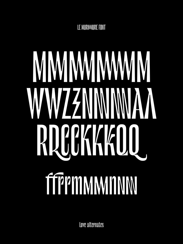
This typeface comes with many glyph variations, meaning alternate letters drawn in an even more original way. Here lies infinite potential which the users will take great delight in exploiting through a random opentype function.
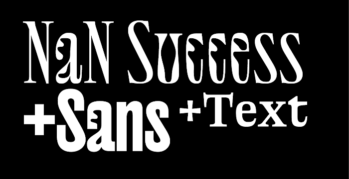
Inga Plönig's Magnet was a great influence on Le Murmure. If you like Le Murmure, you should defintely have a look at the broader family that Magnet has to offer.
Le Murmure was released on Velvetyne Typ Foundry.
Cyrillic design by Alex Slobzheninov
Specimen by Agence Murmure.
Among the Best Cyrillic Typefaces of 2019 (Cyrillic by Alex Slobzheninov)
Certificate of Excellence of Type Directors Club #65
Gold in the type design category at Club des DA 2019
Grand Prix at the Red Dot Design Awards
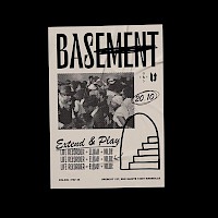
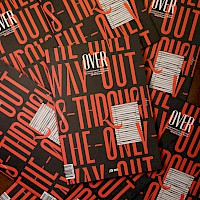
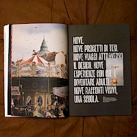
Le Murmure in use
Overmag
Undesign

Basement
Alfred Duret
